Category — Brand Identity / Signage System
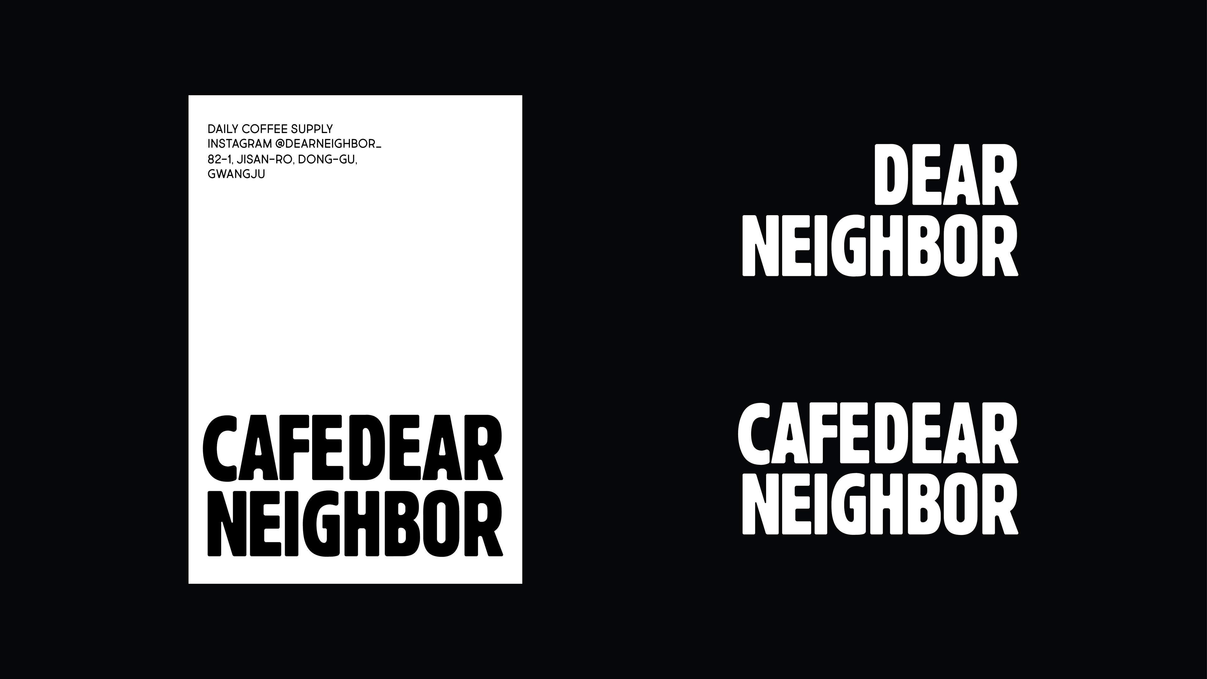
This project was created as a typography-centered
brand identity system.
Creative Direction by L2N Works.
brand identity system.
Creative Direction by L2N Works.
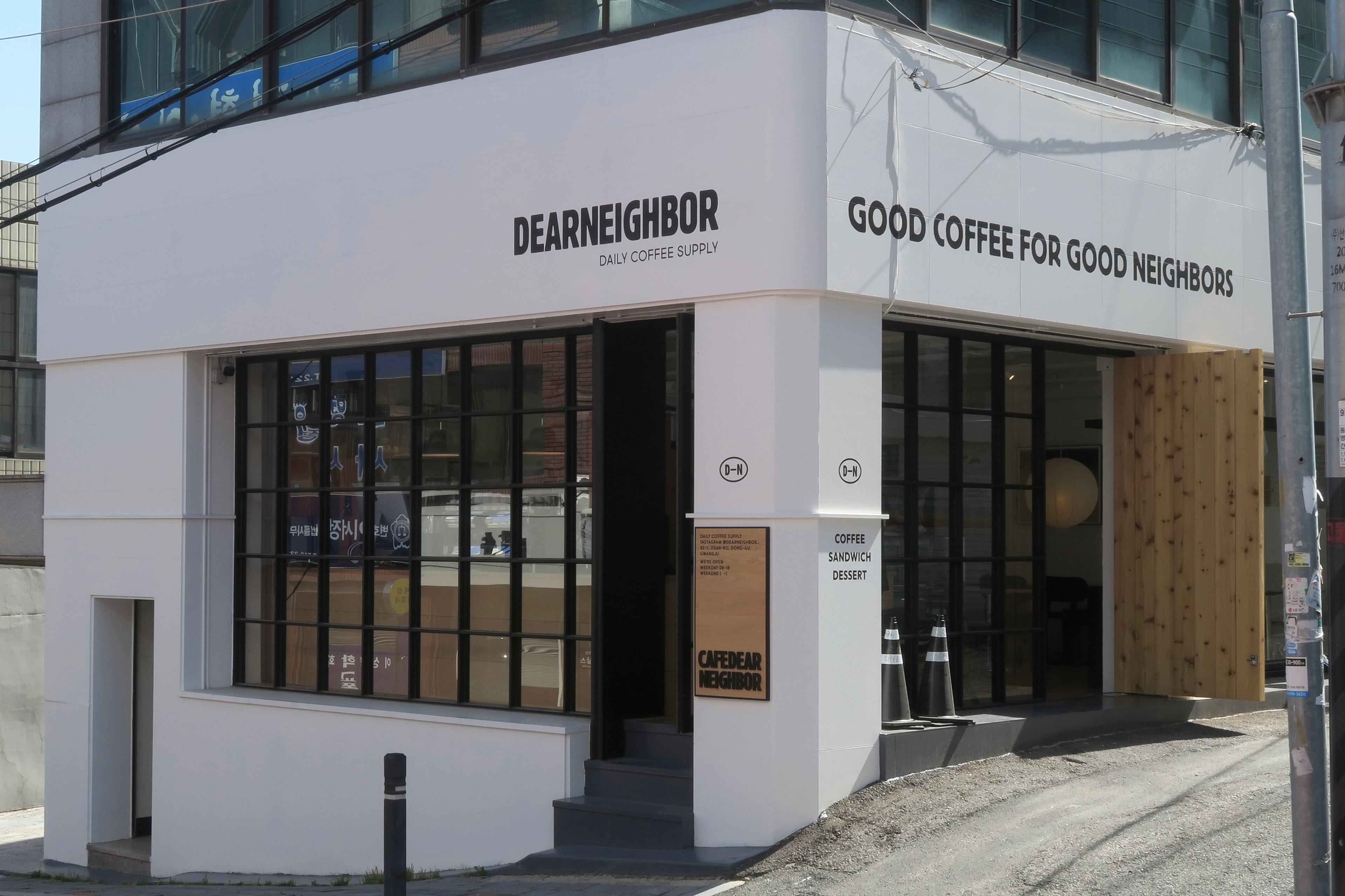
DEARNEIGHBOR는 간결한 타이포그래피를 중심으로
전개한 브랜드 프로젝트입니다.
전개한 브랜드 프로젝트입니다.
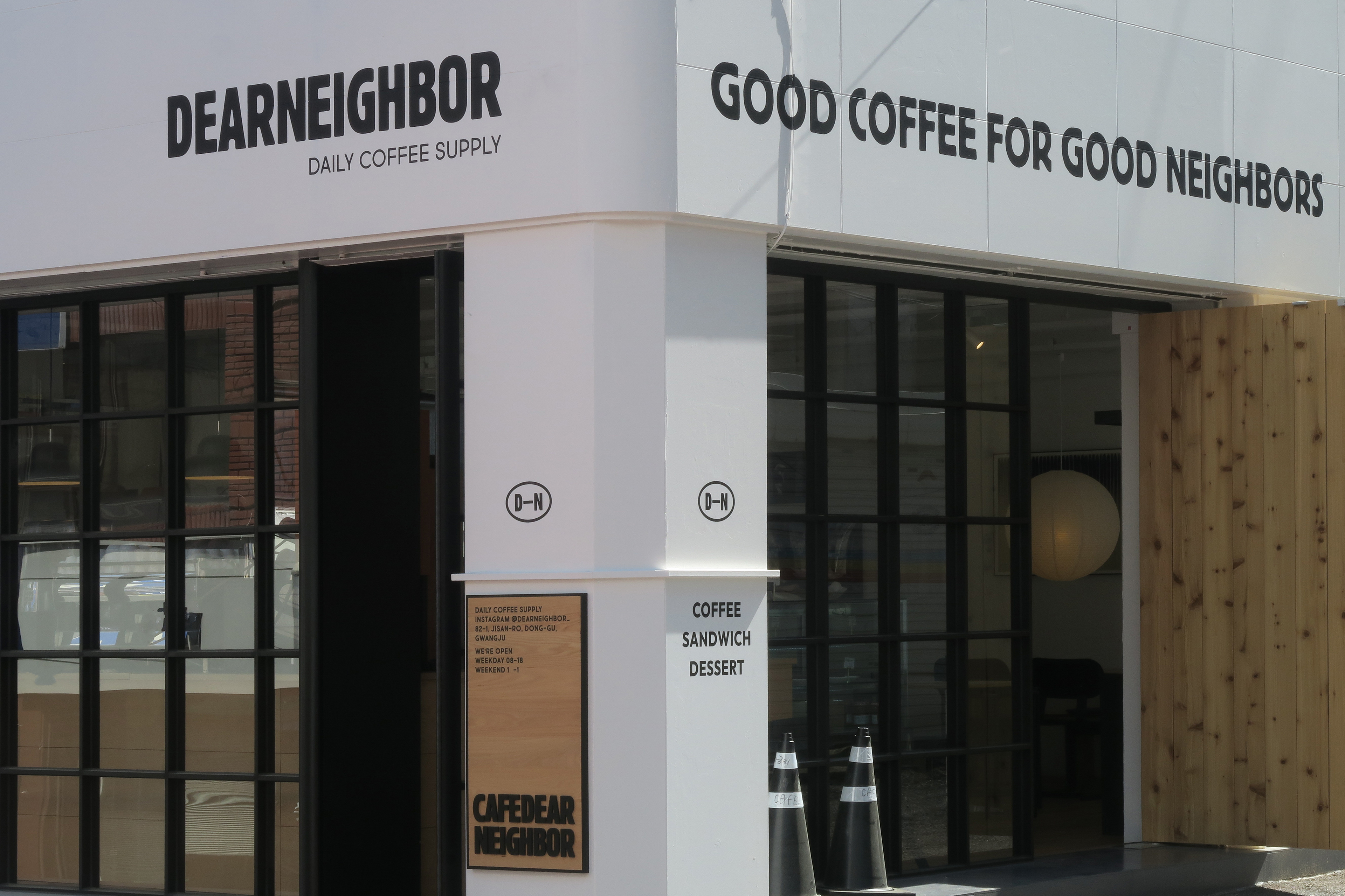
불필요한 요소를 덜어낸 간결한 구조 속에서
굵고 단단한 워드마크는 높은 가독성과 존재감을 유지하며
도시적이고 담백한 브랜드 무드를 전달합니다.
굵고 단단한 워드마크는 높은 가독성과 존재감을 유지하며
도시적이고 담백한 브랜드 무드를 전달합니다.
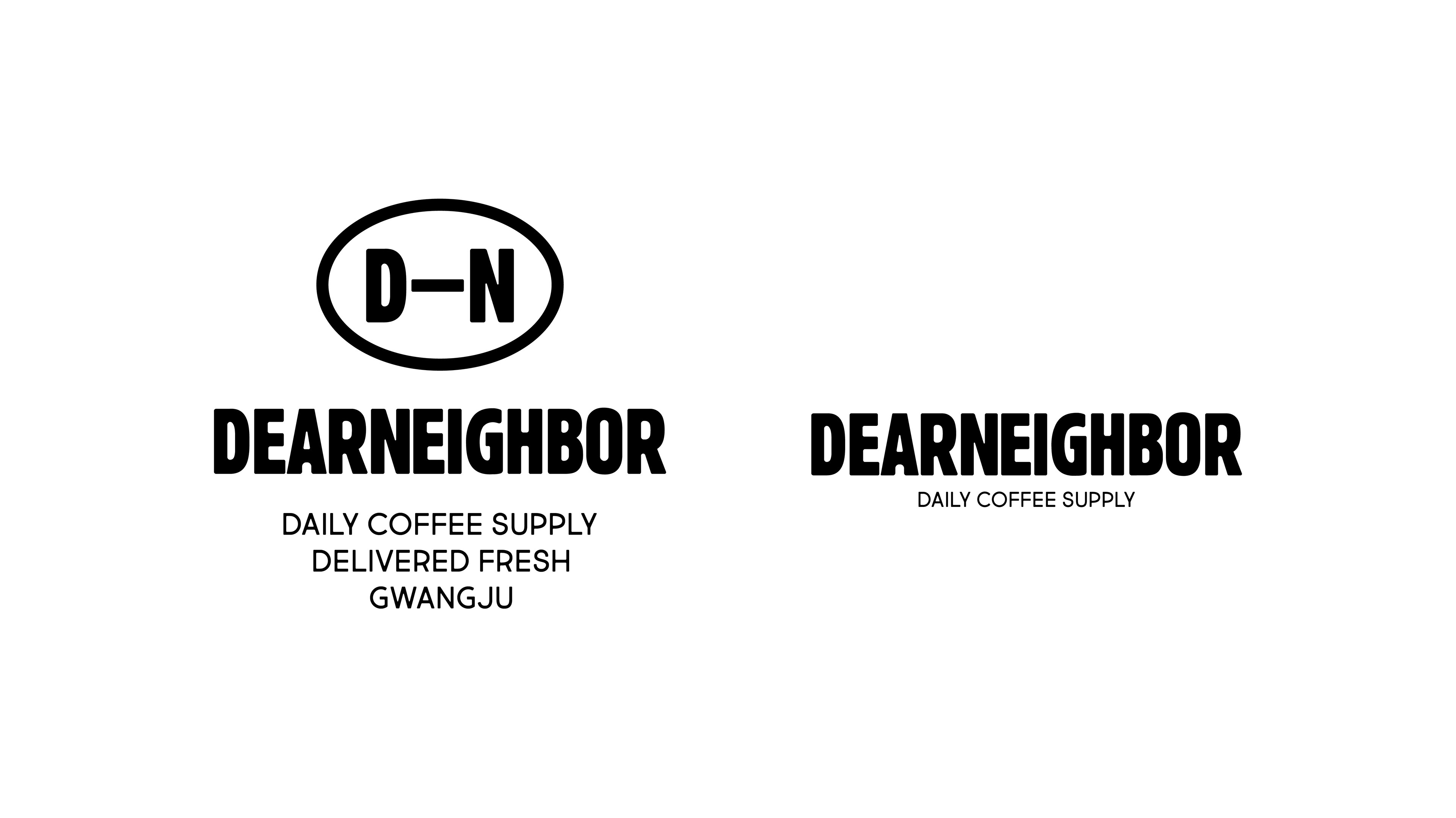
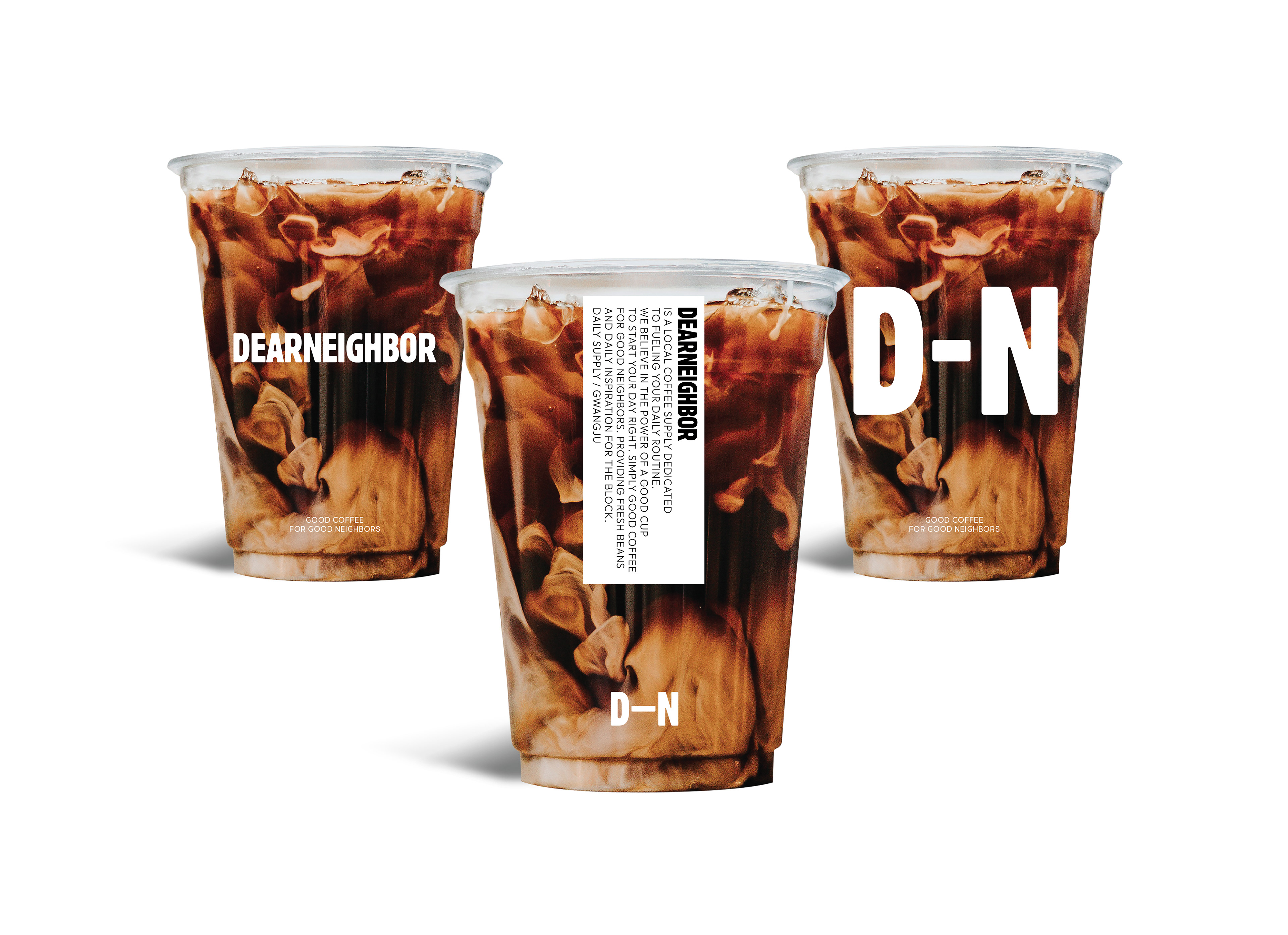
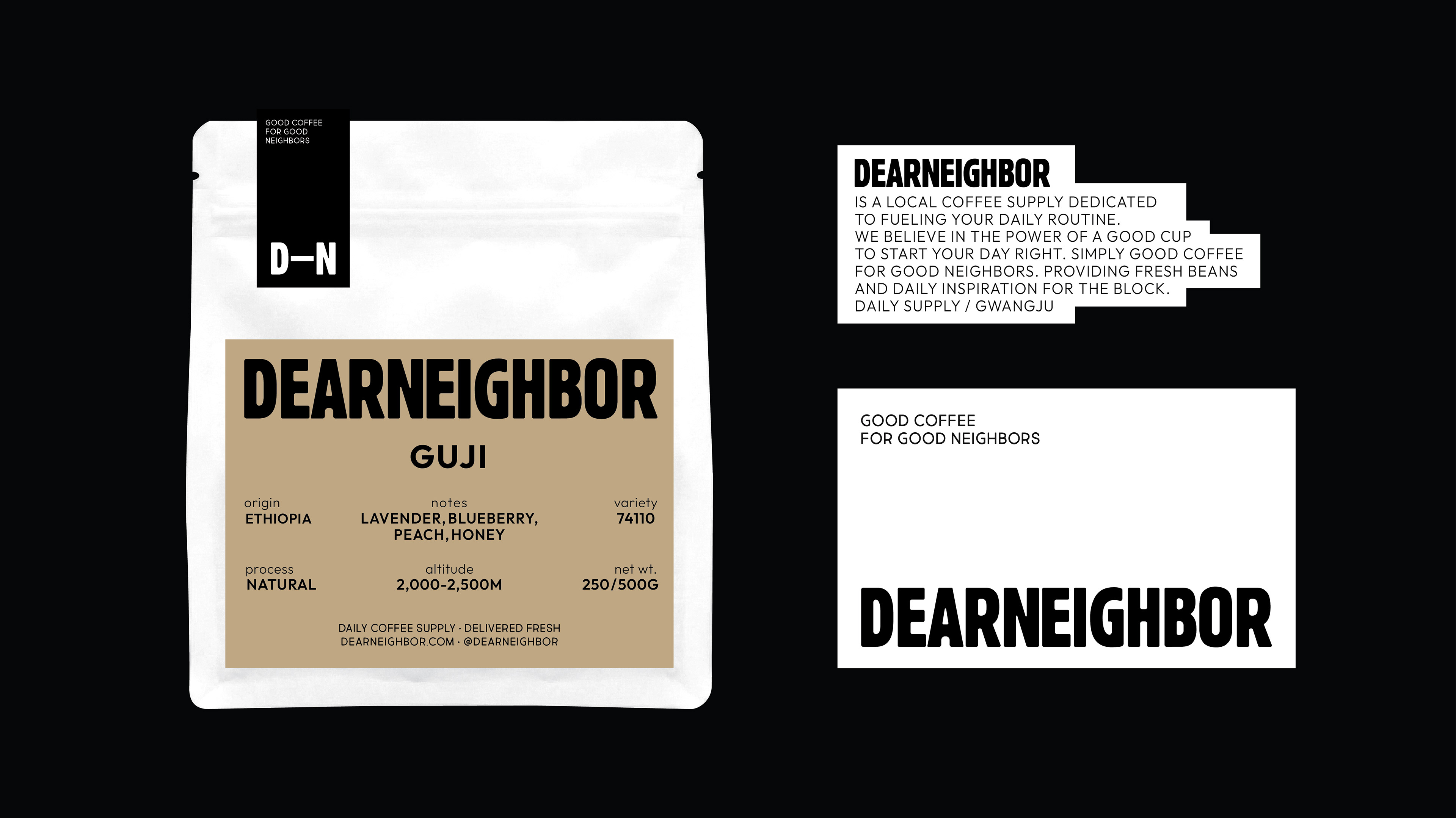
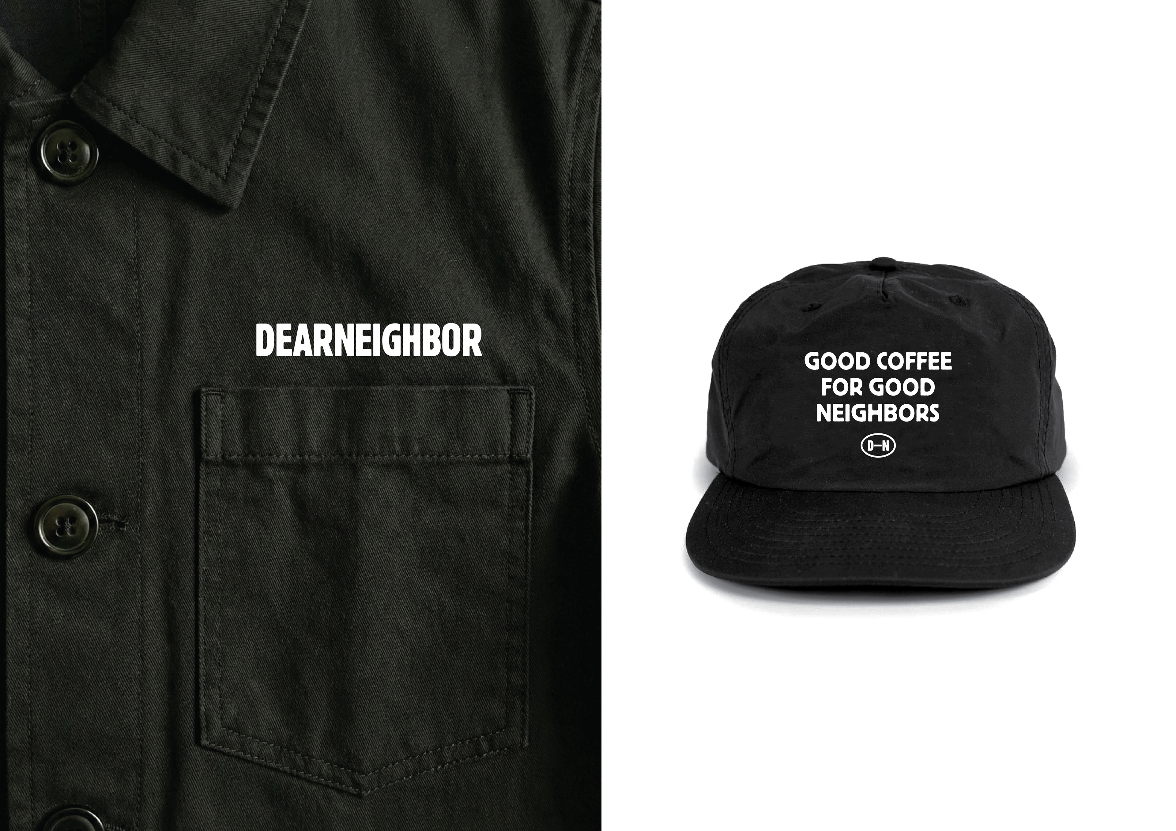
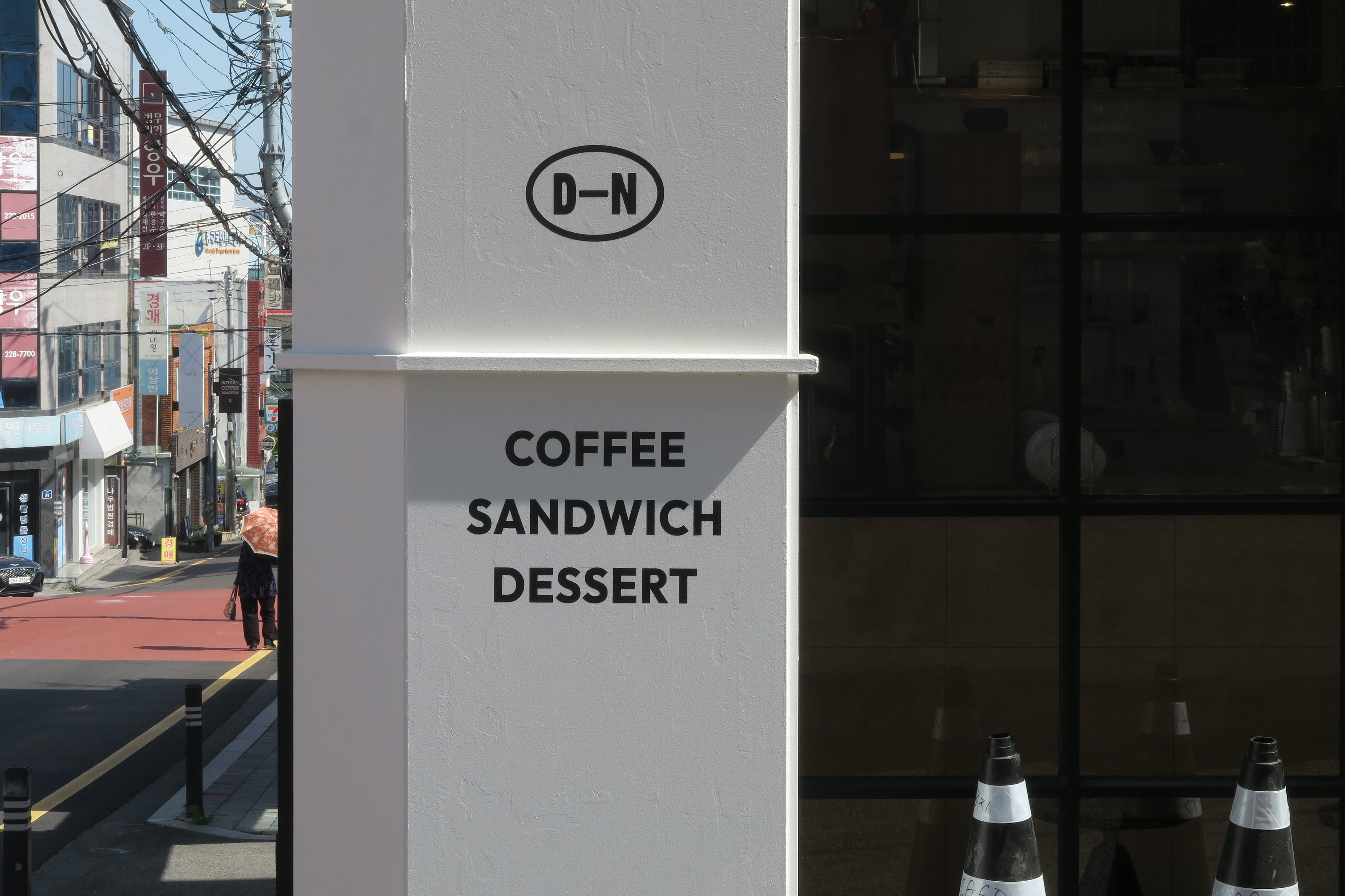
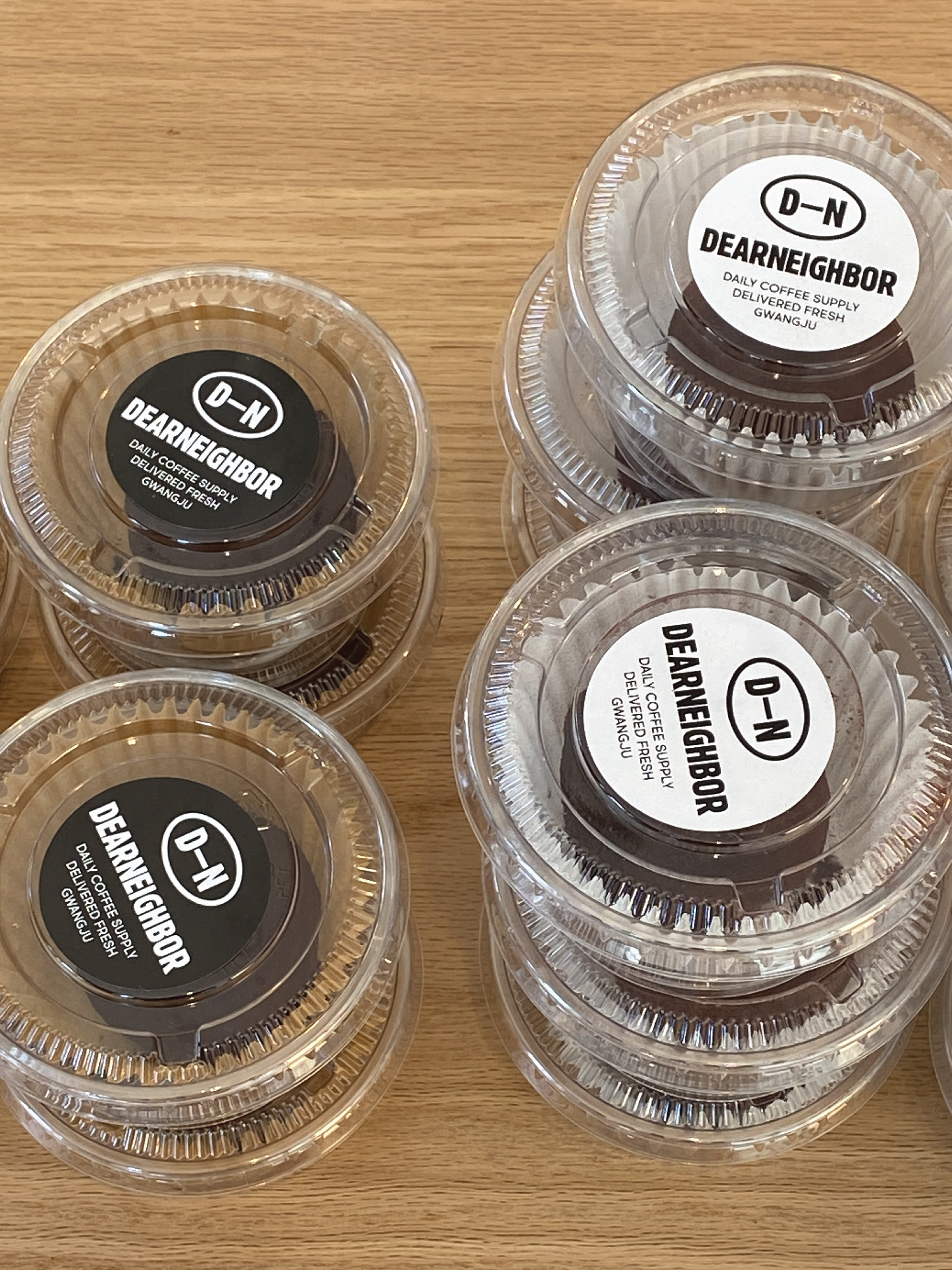
이웃의 연결과 소속감을 의미하는 ‘D-N’ 축약 마크는
브랜드 이니셜을 코드처럼 각인시키는 장치로 작동하며
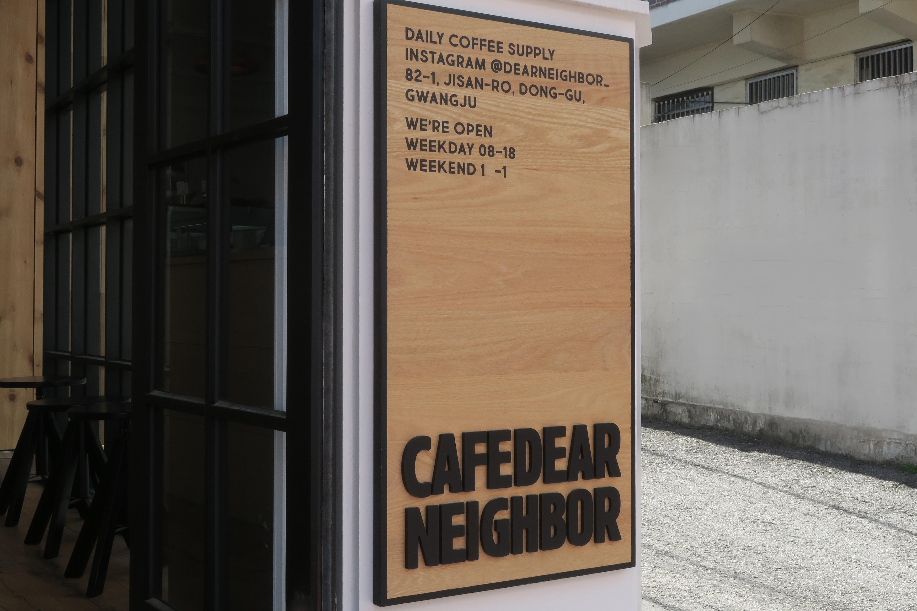
간판부터 패키지, 굿즈까지 다양한 매체 속에서도
일관된 인식과 확장을 가능하게 합니다.
브랜드 이니셜을 코드처럼 각인시키는 장치로 작동하며
간판부터 패키지, 굿즈까지 다양한 매체 속에서도
일관된 인식과 확장을 가능하게 합니다.
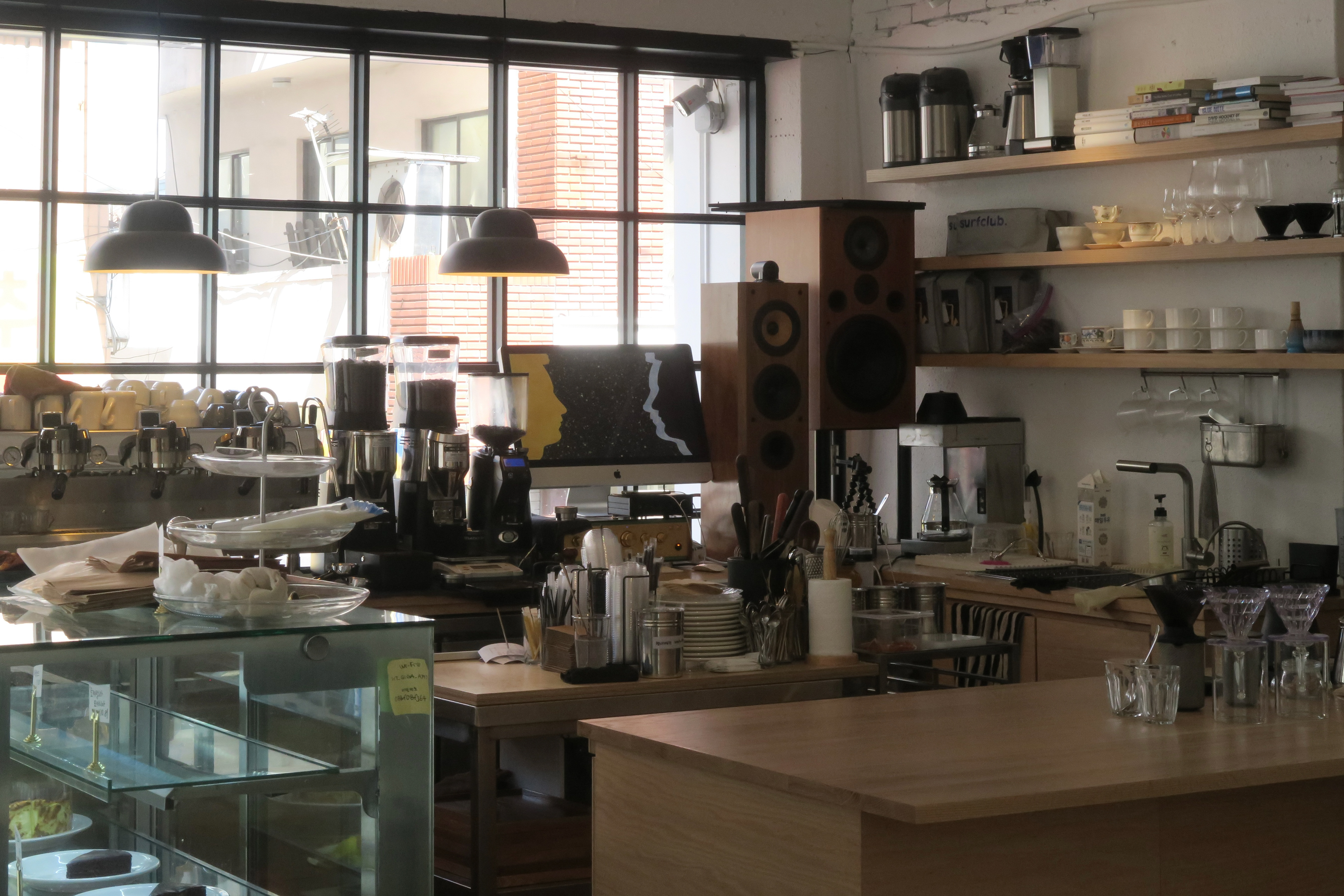
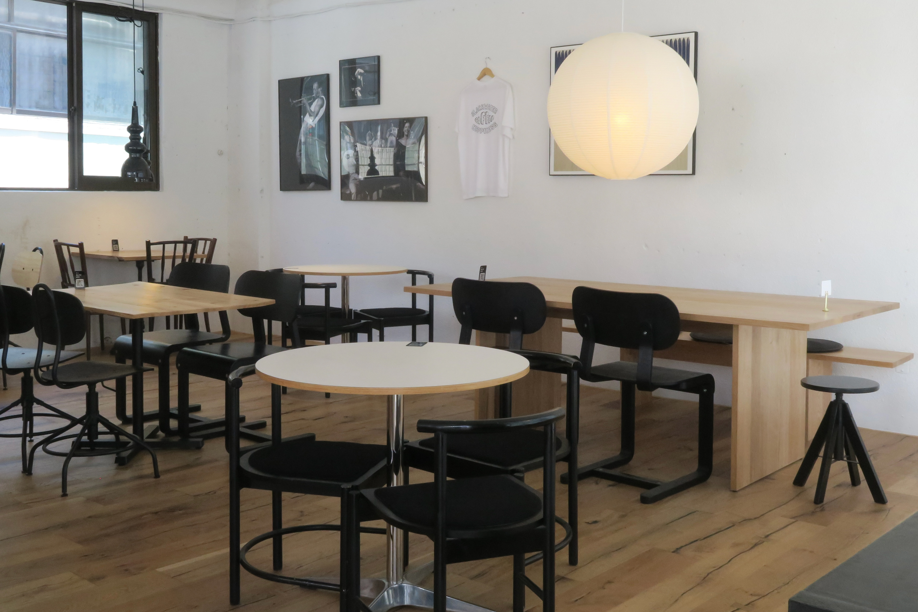
DEARNEIGHBOR는 공간과 그래픽, 사인이
자연스럽게 연결되는 타이포그래피 중심의 브랜드 시스템을
구축한 프로젝트입니다.
자연스럽게 연결되는 타이포그래피 중심의 브랜드 시스템을
구축한 프로젝트입니다.
This project is a wordmark-based identity system
built around bold typography and structured simplicity.
built around bold typography and structured simplicity.
By removing unnecessary elements,
the identity focuses on strong and solid letterforms
that maintain clarity, visibility, and presence
across various environments and applications.
the identity focuses on strong and solid letterforms
that maintain clarity, visibility, and presence
across various environments and applications.
The “D-N” abbreviation mark symbolizes connection and
belonging, functioning as a coded signature
of the brand identity. Designed for flexible scalability,
it extends consistently across signage, packaging,
and merchandise.
belonging, functioning as a coded signature
of the brand identity. Designed for flexible scalability,
it extends consistently across signage, packaging,
and merchandise.
DEARNEIGHBOR establishes a typography-driven
brand system where space, graphics, and signage work
together to create a clean and urban brand experience.
brand system where space, graphics, and signage work
together to create a clean and urban brand experience.
@l2nworks