Category — Brand Identity / Signage System
This project was created as a typography-centered
brand identity system.
Creative Direction by L2N Works.
brand identity system.
Creative Direction by L2N Works.
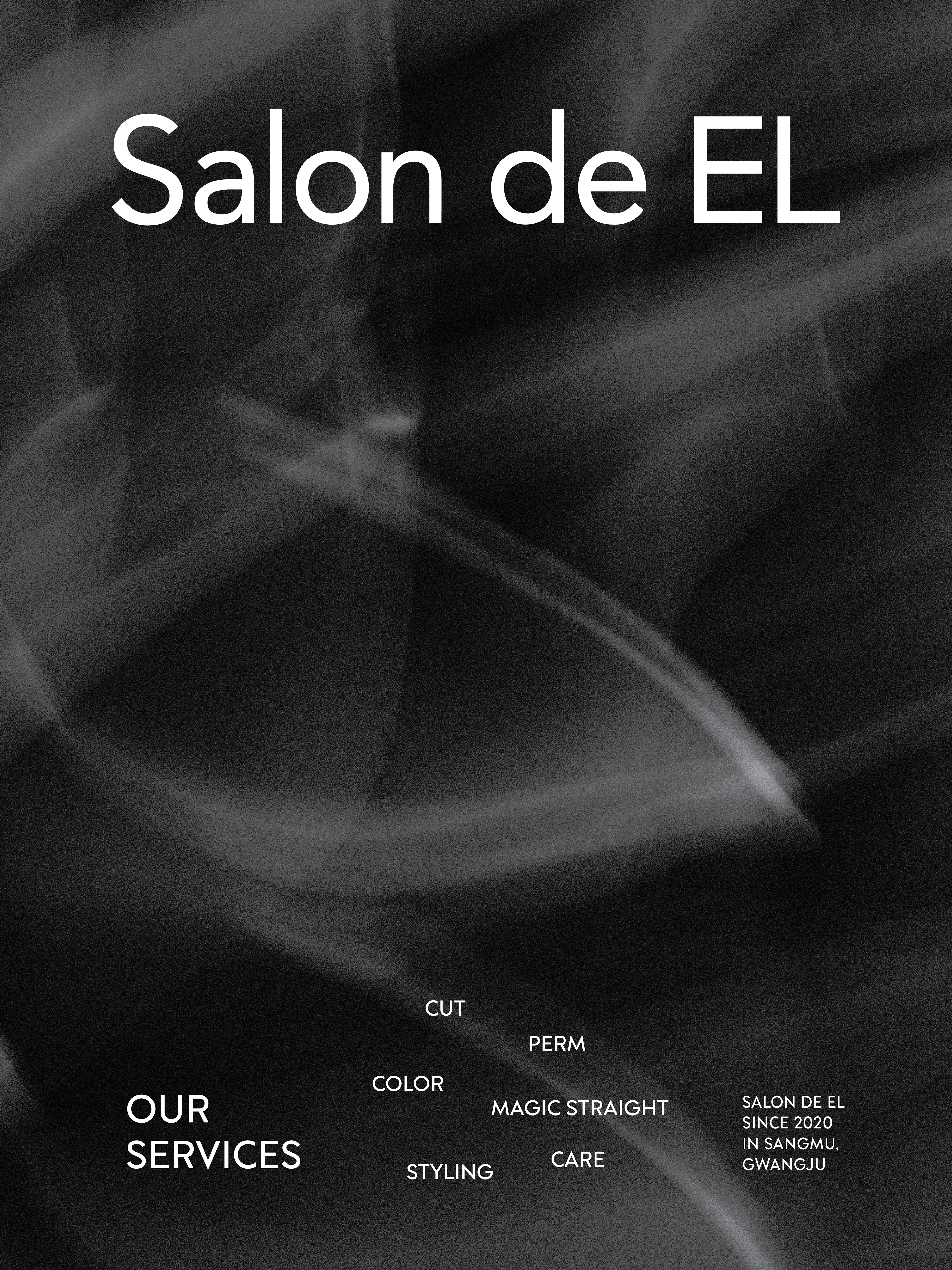
살롱드엘은 미니멀한 로고타입과 심벌을 중심으로
전개한 헤어살롱 브랜드 프로젝트입니다.
전개한 헤어살롱 브랜드 프로젝트입니다.
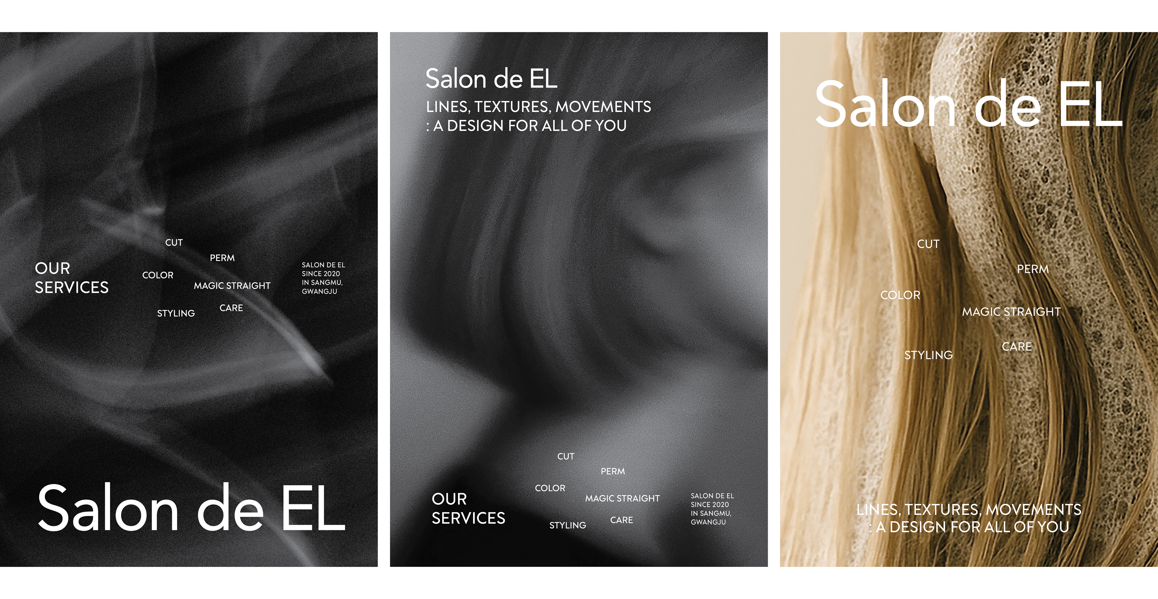
헤어의 선(line), 질감(texture), 그리고 움직임(movement)에서
영감을 받아 사인, 그래픽, 공간 전반에 브랜드의 섬세하고
현대적인 브랜드 무드를 담아냈습니다.
영감을 받아 사인, 그래픽, 공간 전반에 브랜드의 섬세하고
현대적인 브랜드 무드를 담아냈습니다.
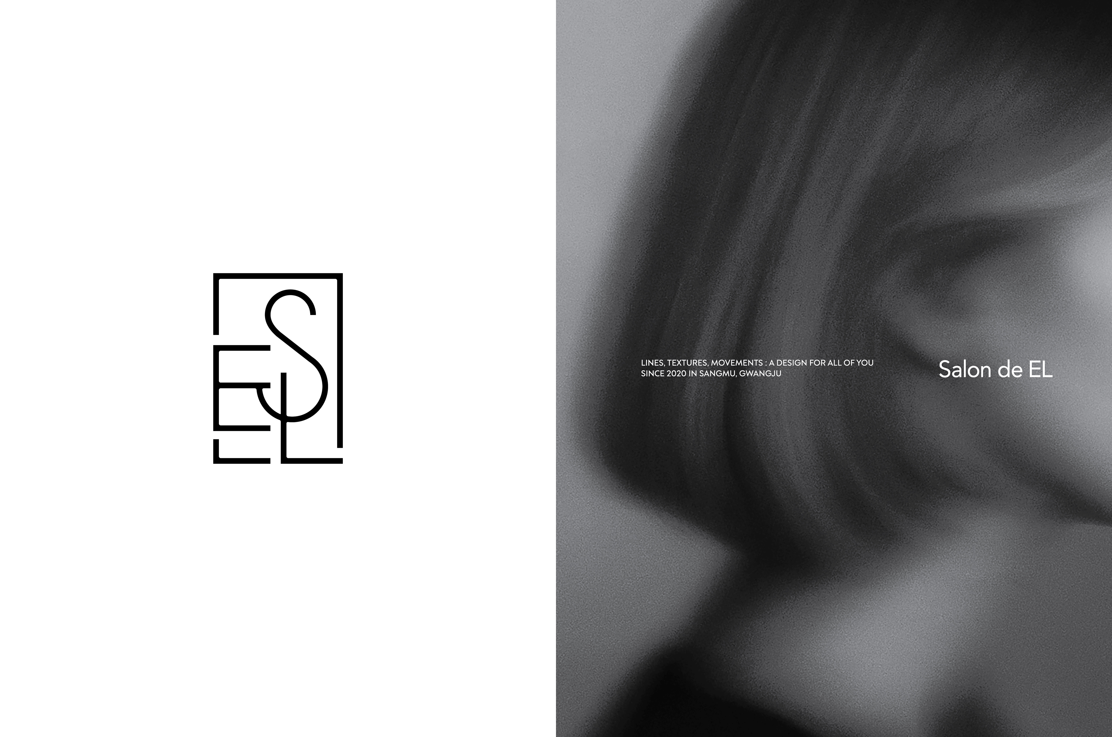
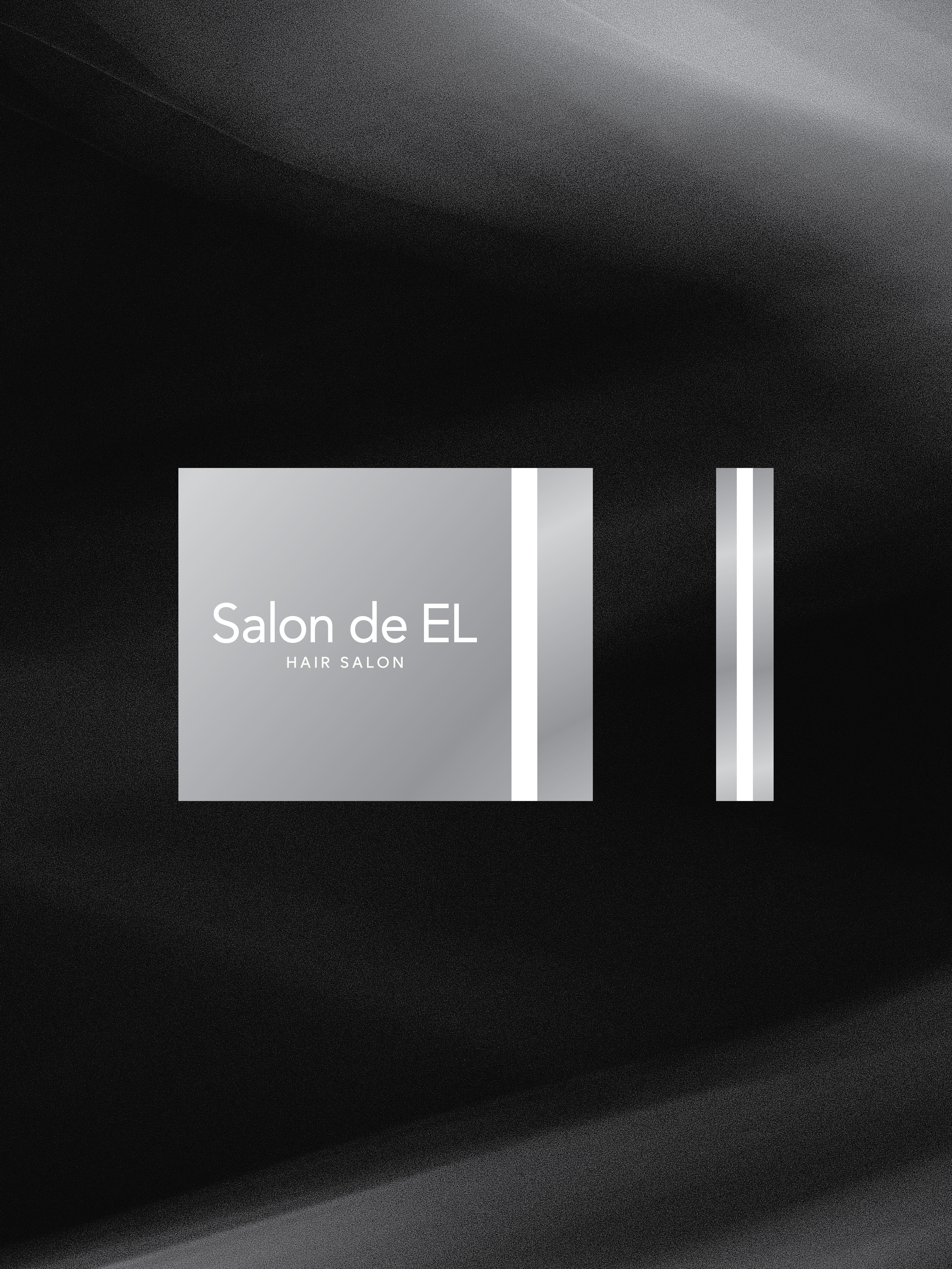
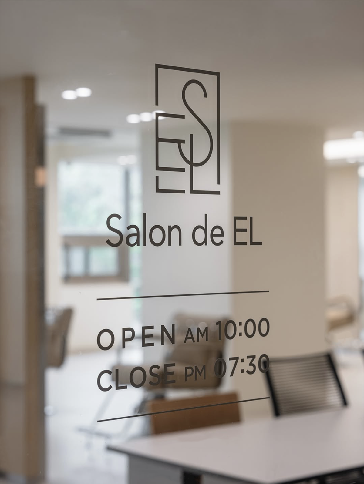
S, E, L 이니셜을 기반으로 제작된 심벌마크는
직선과 곡선의 조화를 통해 부드러움과 구조감을 동시에 표현하며
미니멀한 산세리프 로고타입과 함께
세련되고 정제된 브랜드 이미지를 전달합니다.
직선과 곡선의 조화를 통해 부드러움과 구조감을 동시에 표현하며
미니멀한 산세리프 로고타입과 함께
세련되고 정제된 브랜드 이미지를 전달합니다.
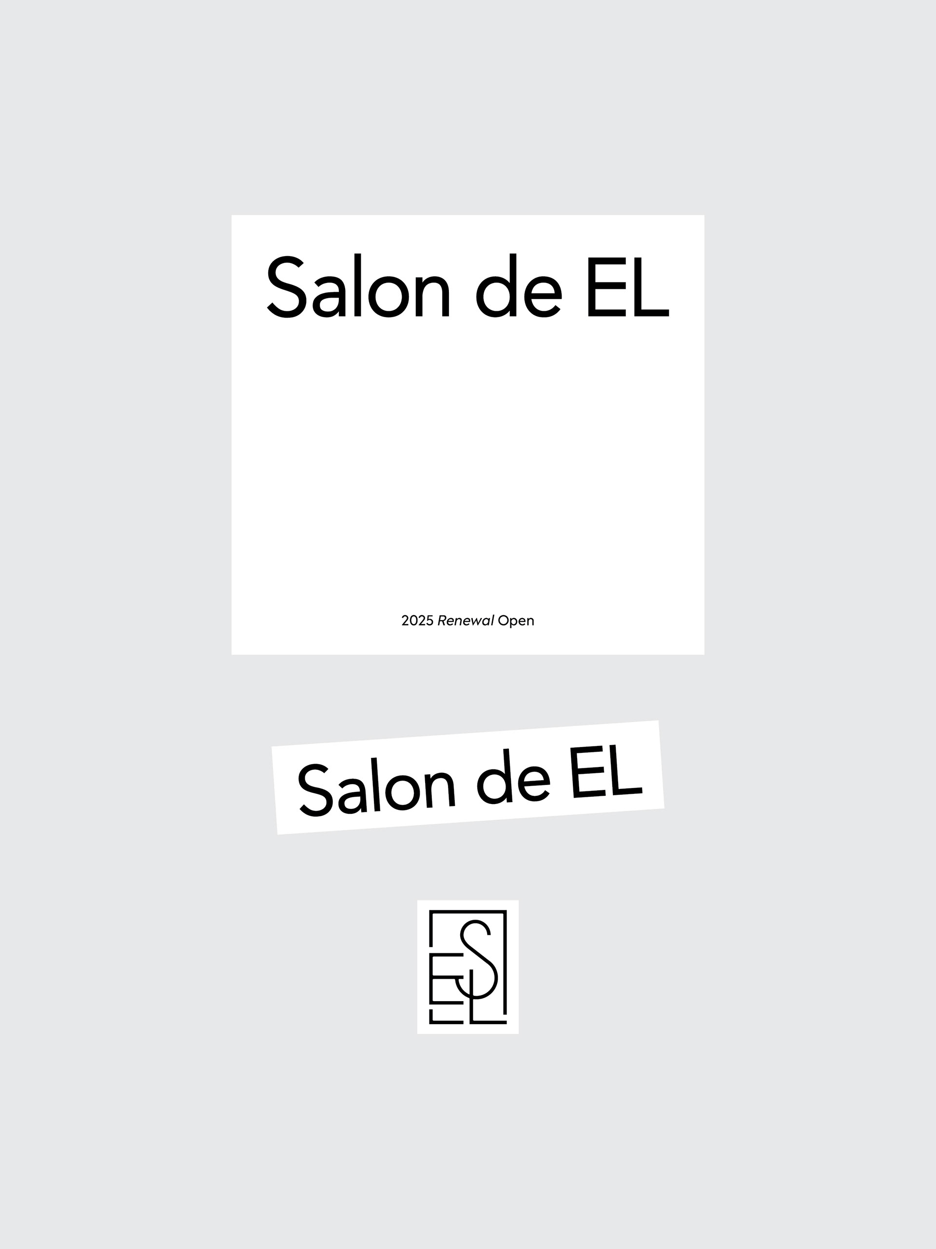
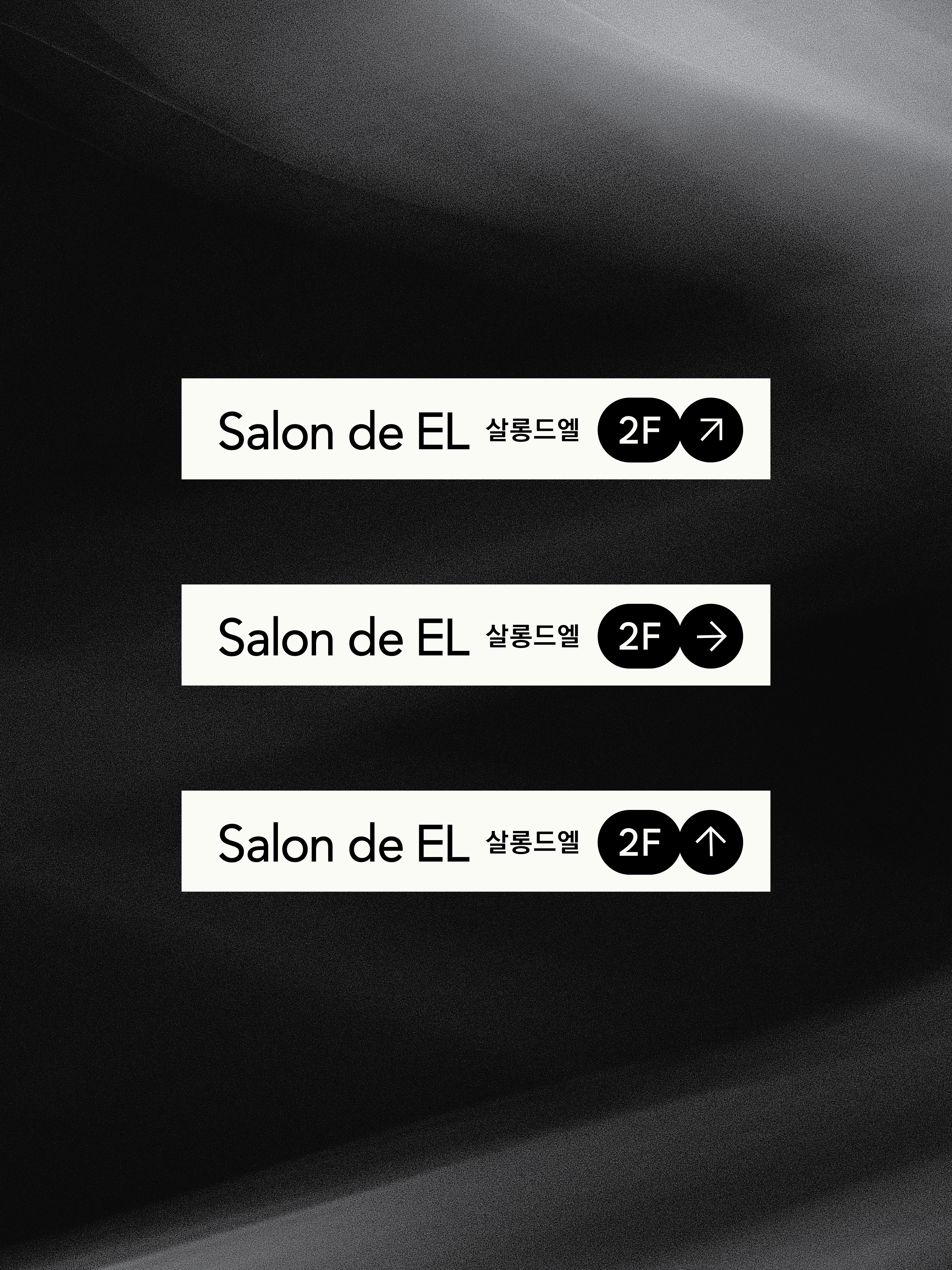
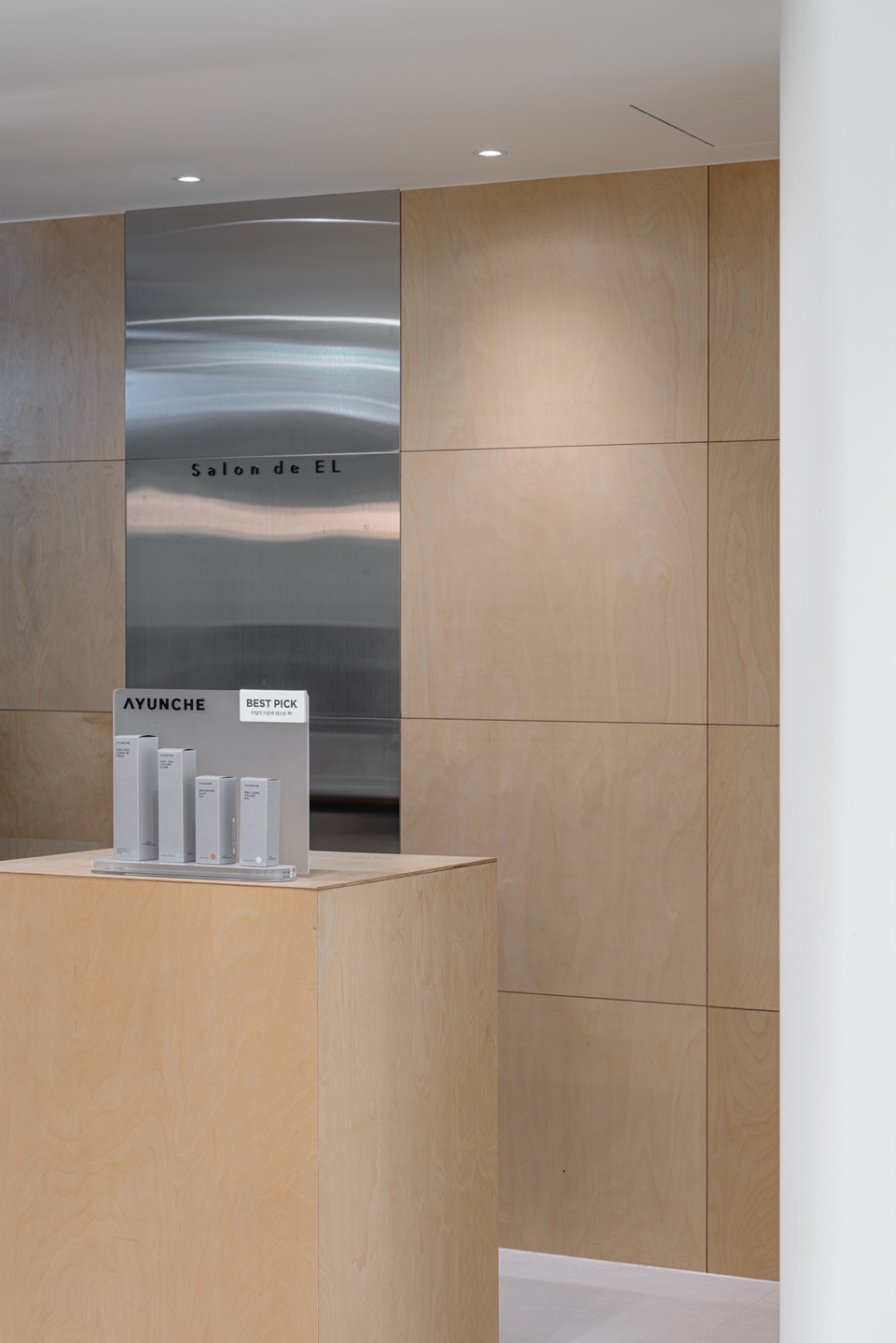
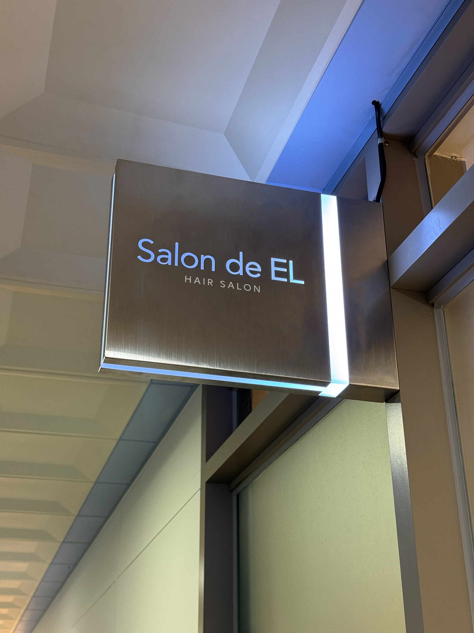
간판, 메뉴판, 그래픽 등 다양한 브랜드 접점에서도
높은 가독성과 일관된 인상을 유지할 수 있도록 설계했으며
공간과 시각 요소가 자연스럽게 연결되는
브랜드 경험을 구축했습니다.
높은 가독성과 일관된 인상을 유지할 수 있도록 설계했으며
공간과 시각 요소가 자연스럽게 연결되는
브랜드 경험을 구축했습니다.
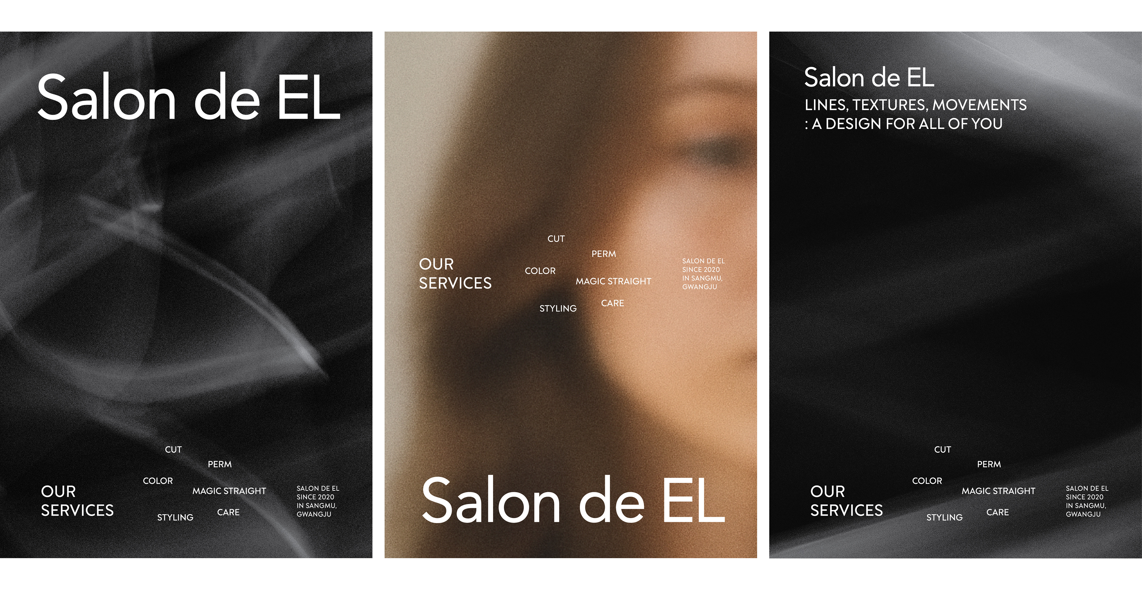
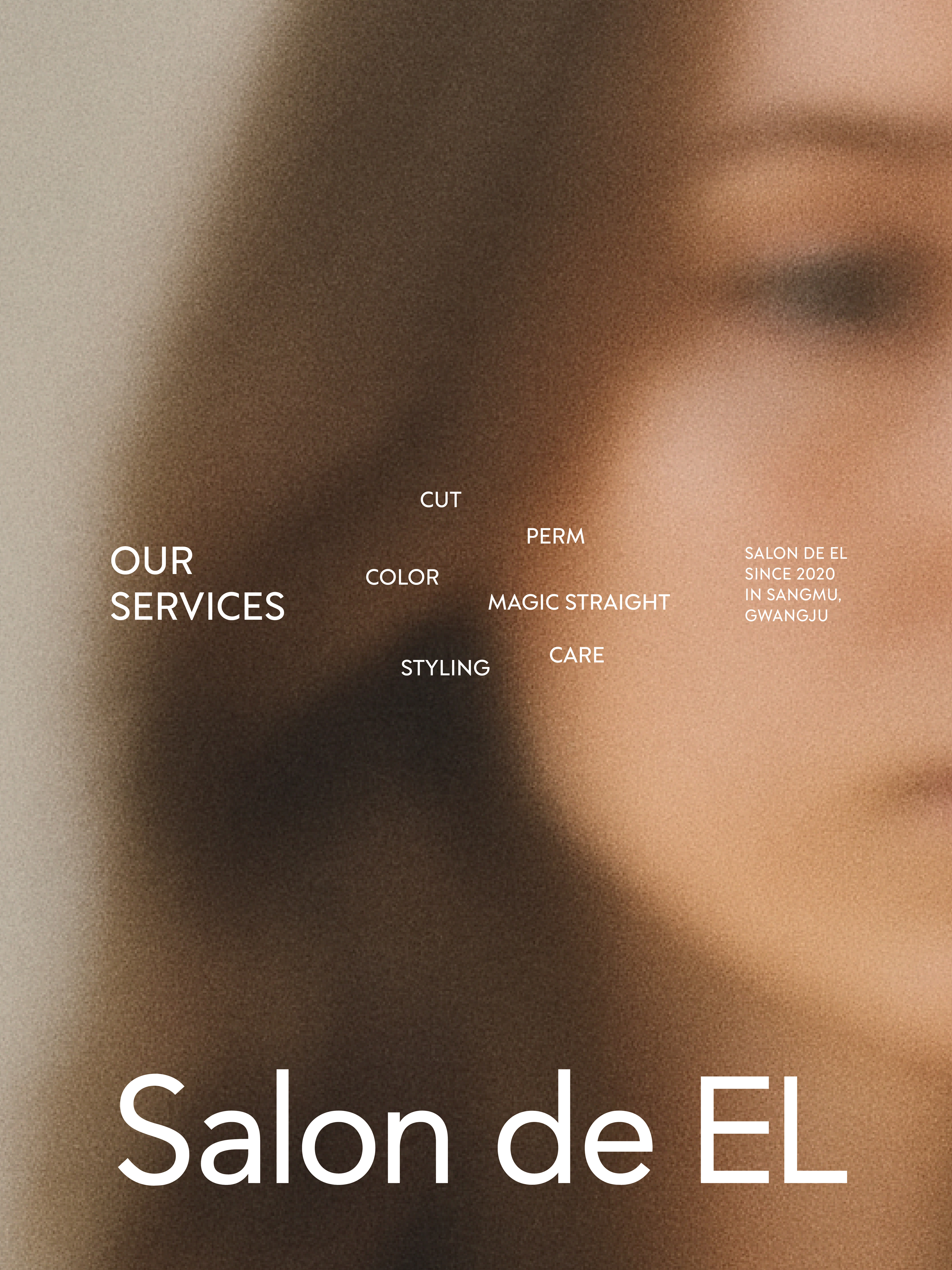
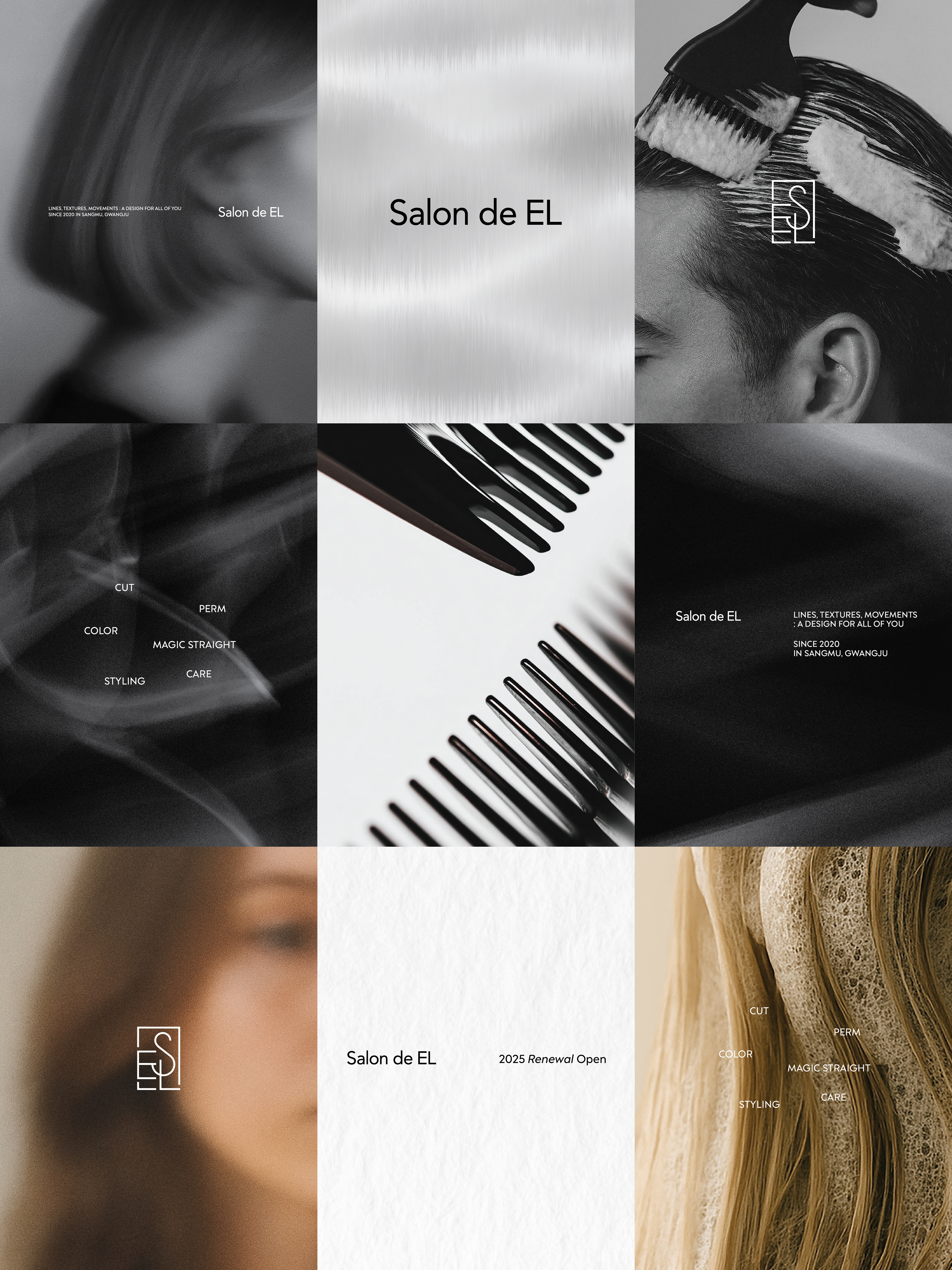
Salon de EL is a hair salon brand project developed
around a minimal logotype and symbol system.
around a minimal logotype and symbol system.
Inspired by the line, texture, and movement of hair,
the project was designed to establish a refined and contemporary mood
consistently across signage, graphics, and spatial applications.
the project was designed to establish a refined and contemporary mood
consistently across signage, graphics, and spatial applications.
The symbol mark, created from the initials S, E, and L,
balances soft curves and structured forms to express
both delicacy and stability.
Combined with a minimal sans-serif logotype,
the identity delivers a sophisticated and polished brand image.
balances soft curves and structured forms to express
both delicacy and stability.
Combined with a minimal sans-serif logotype,
the identity delivers a sophisticated and polished brand image.
Designed to maintain strong visibility and consistency
across various brand touchpoints — including signage, menus, and graphics —
the system organically connects spatial and visual elements
to create a cohesive brand experience.
across various brand touchpoints — including signage, menus, and graphics —
the system organically connects spatial and visual elements
to create a cohesive brand experience.
@l2nworks