
Category — Brand Identity / Signage System
A brand identity renewal project for Yokel Coffee,
developed around a distinctive symbol, typography, and visual system.
Creative Direction by L2N Works
developed around a distinctive symbol, typography, and visual system.
Creative Direction by L2N Works
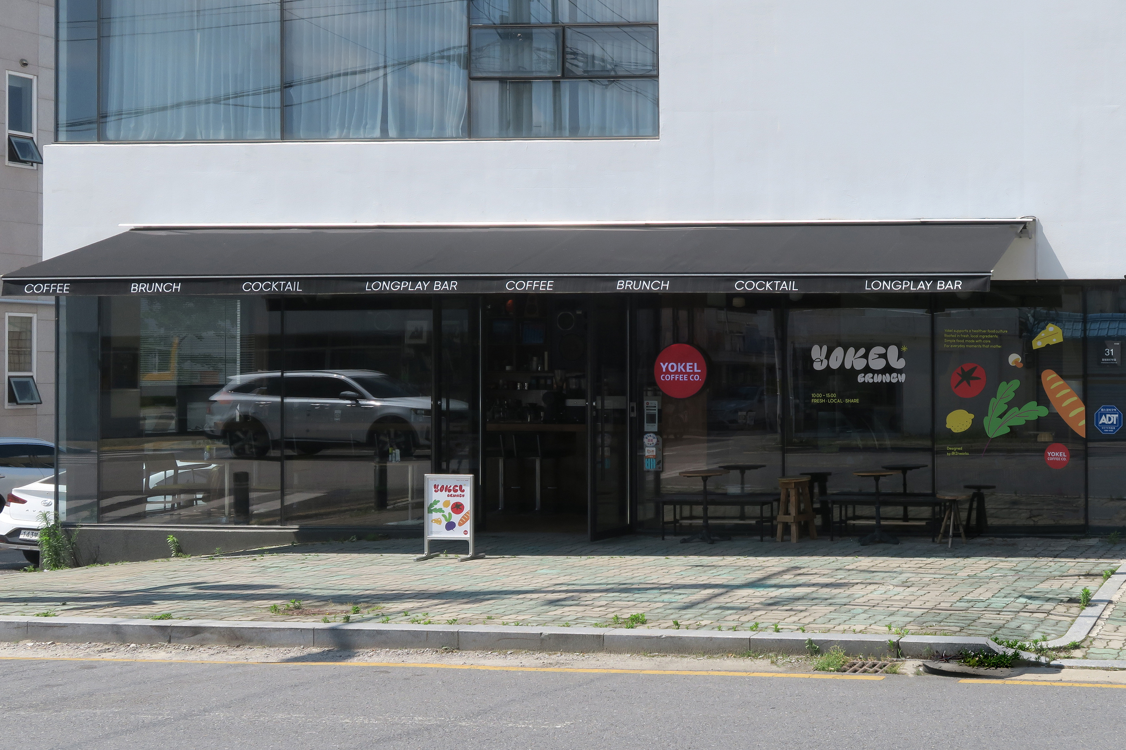
요켈커피는 계림동에서 산수동으로 이전하며
브랜드 아이덴티티를 새롭게 정립한
F&B 브랜드 리뉴얼 프로젝트입니다.
브랜드 아이덴티티를 새롭게 정립한
F&B 브랜드 리뉴얼 프로젝트입니다.
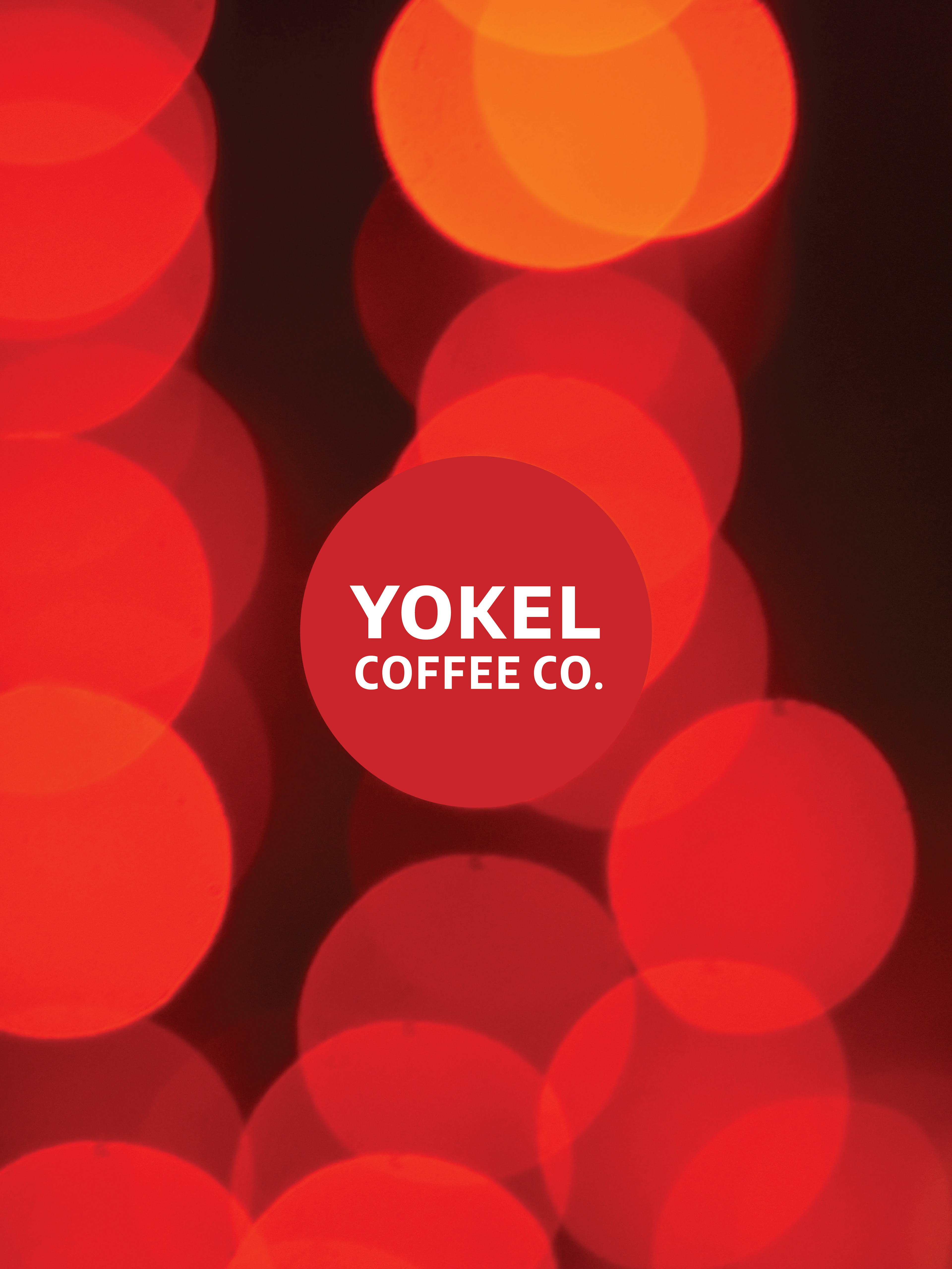
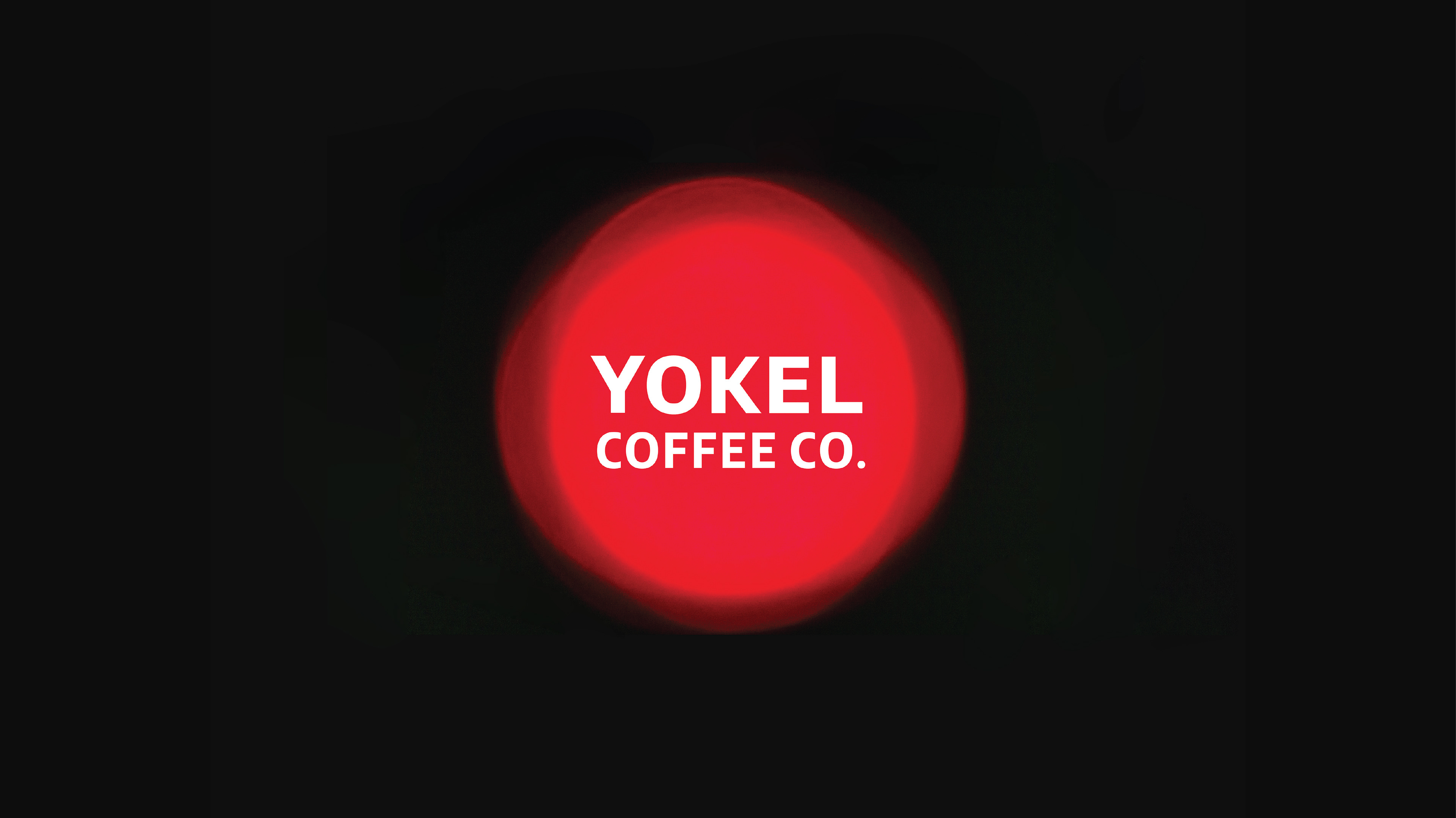
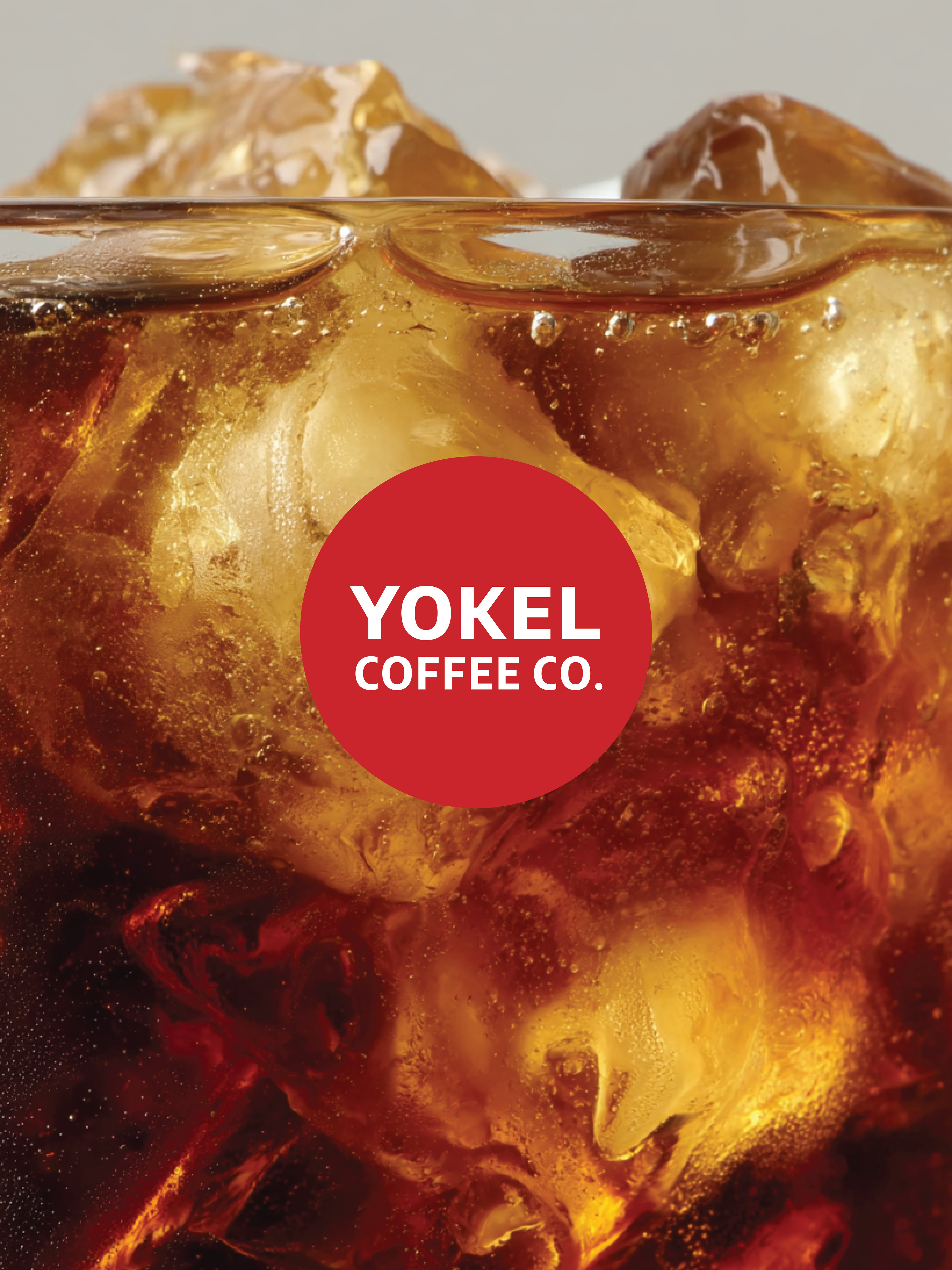
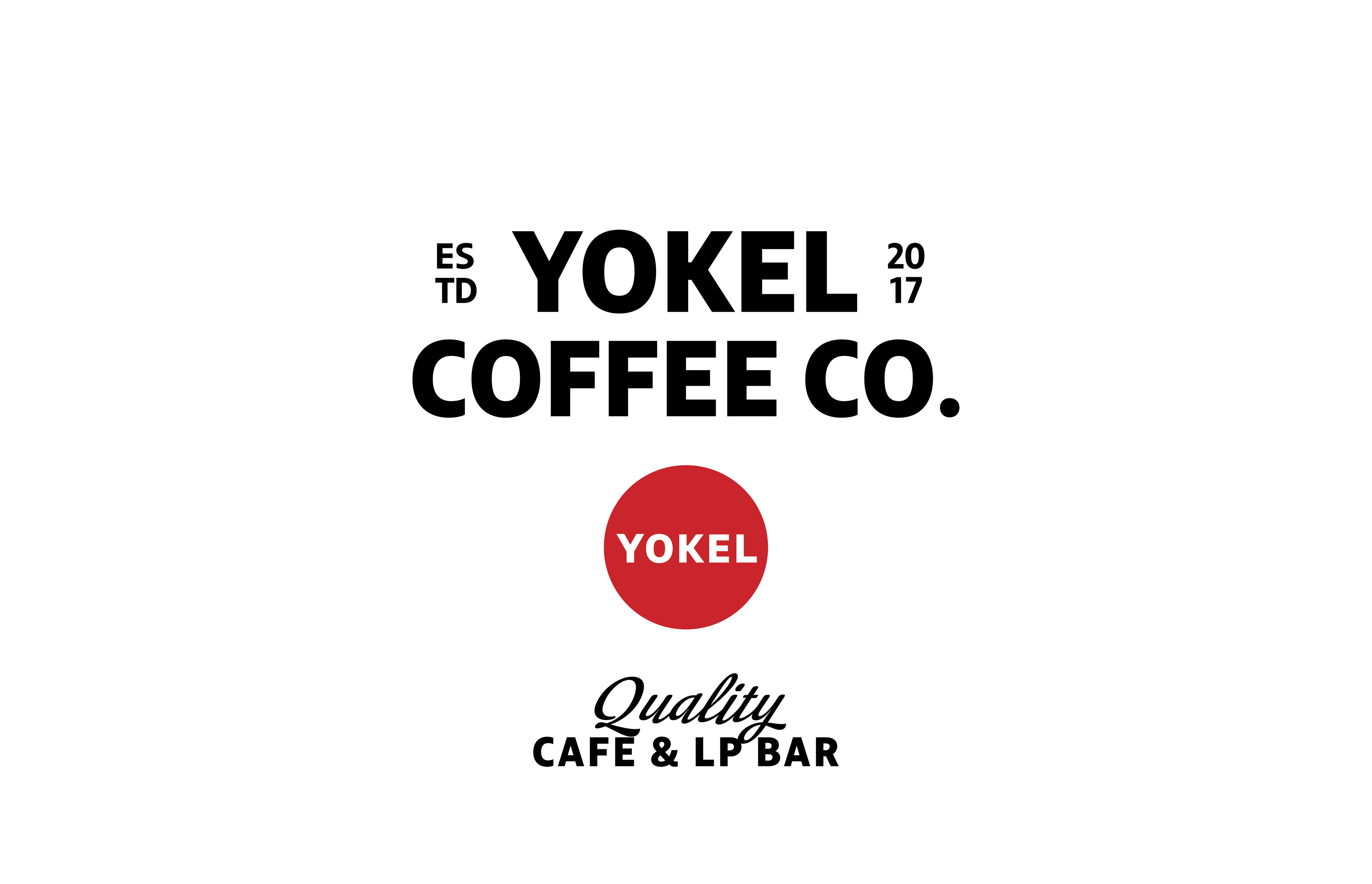
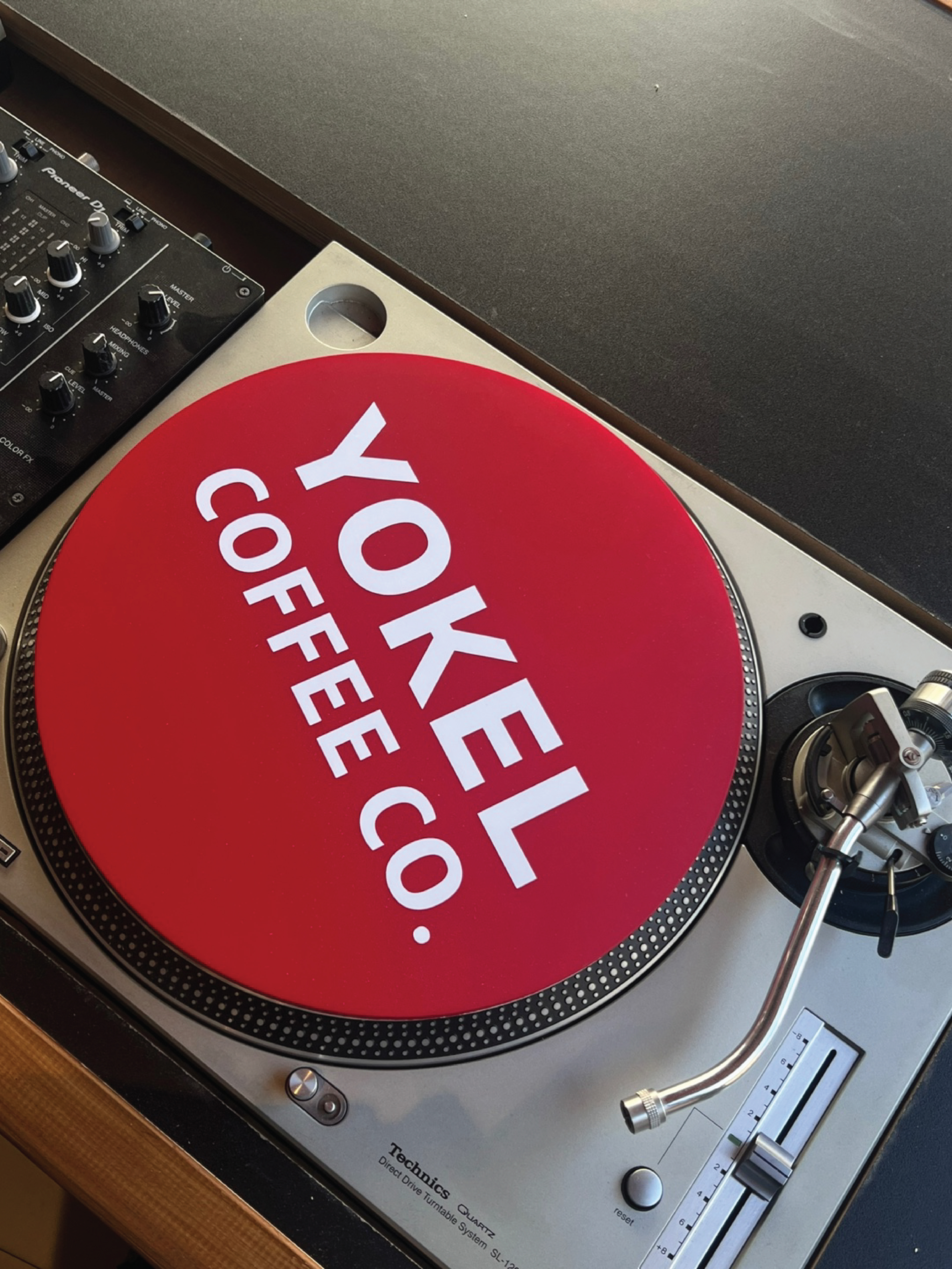
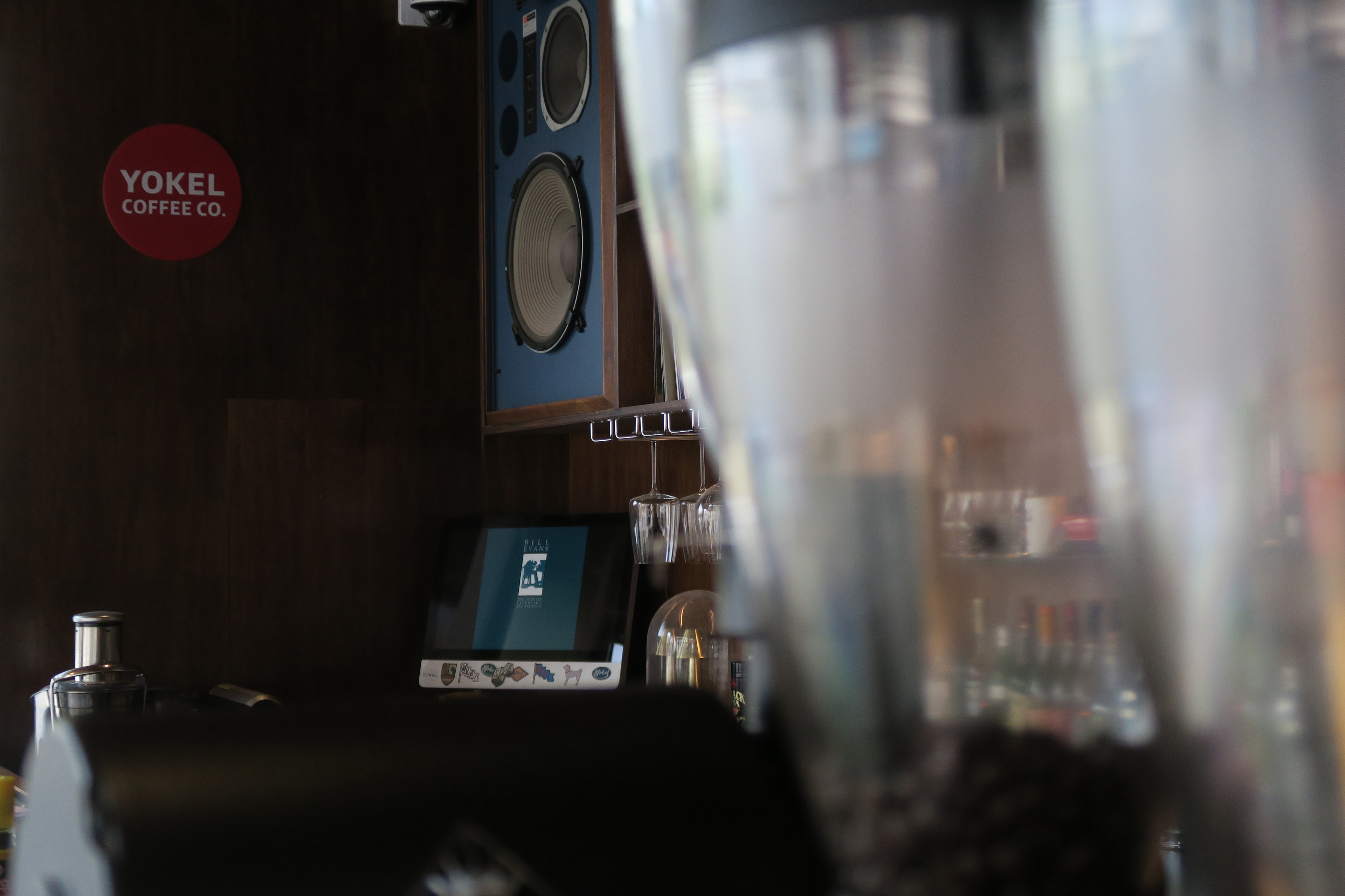
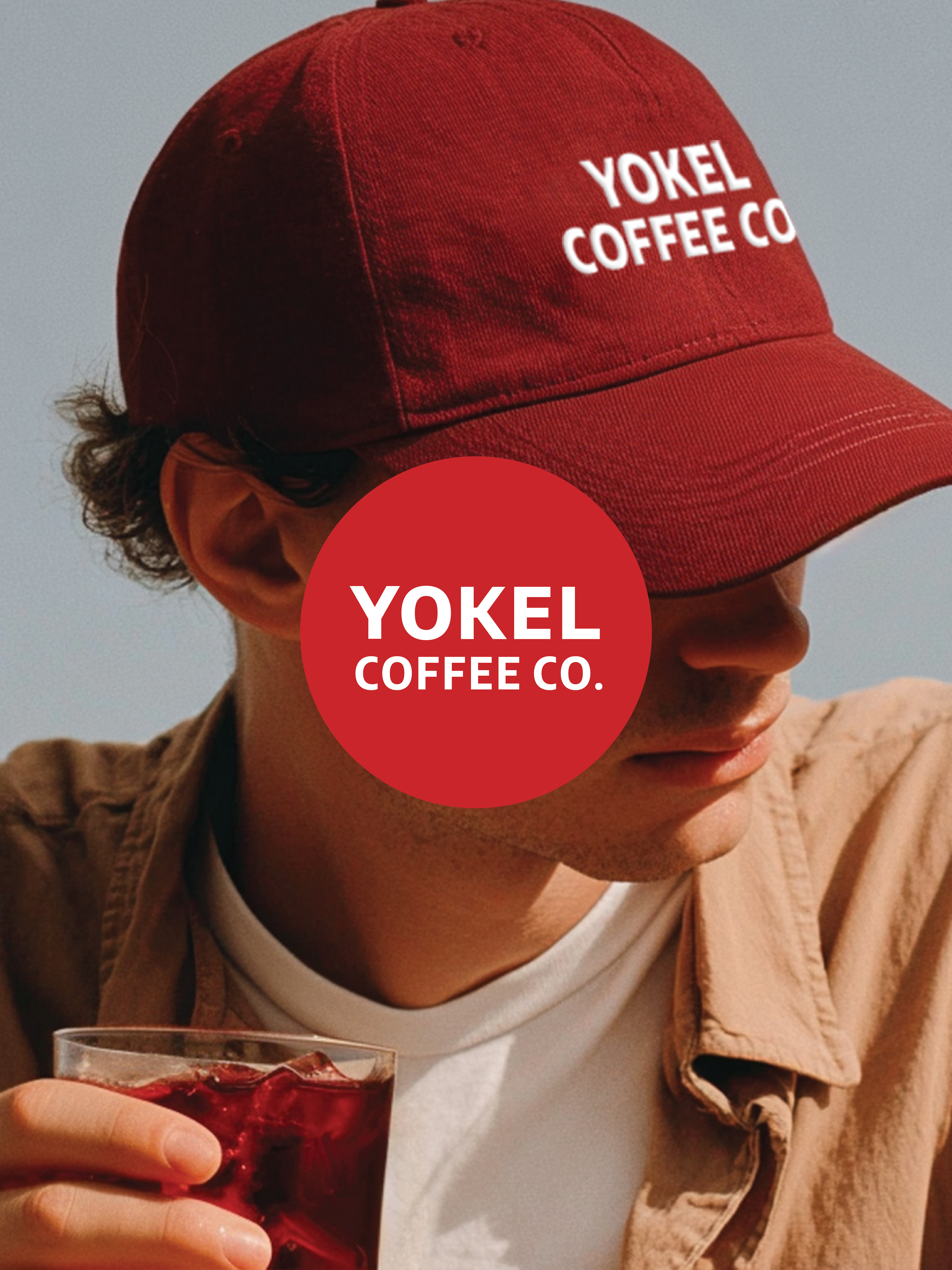
도심의 버스 스탑 버튼에서 착안한 원형 심벌은
멀리서도 선명하게 인지되는 존재감과
보케처럼 퍼지는 따뜻한 잔상을 시각화하며
요켈이 늘 일상 곁에 머무는 브랜드라는 의미를 담고 있습니다.
멀리서도 선명하게 인지되는 존재감과
보케처럼 퍼지는 따뜻한 잔상을 시각화하며
요켈이 늘 일상 곁에 머무는 브랜드라는 의미를 담고 있습니다.
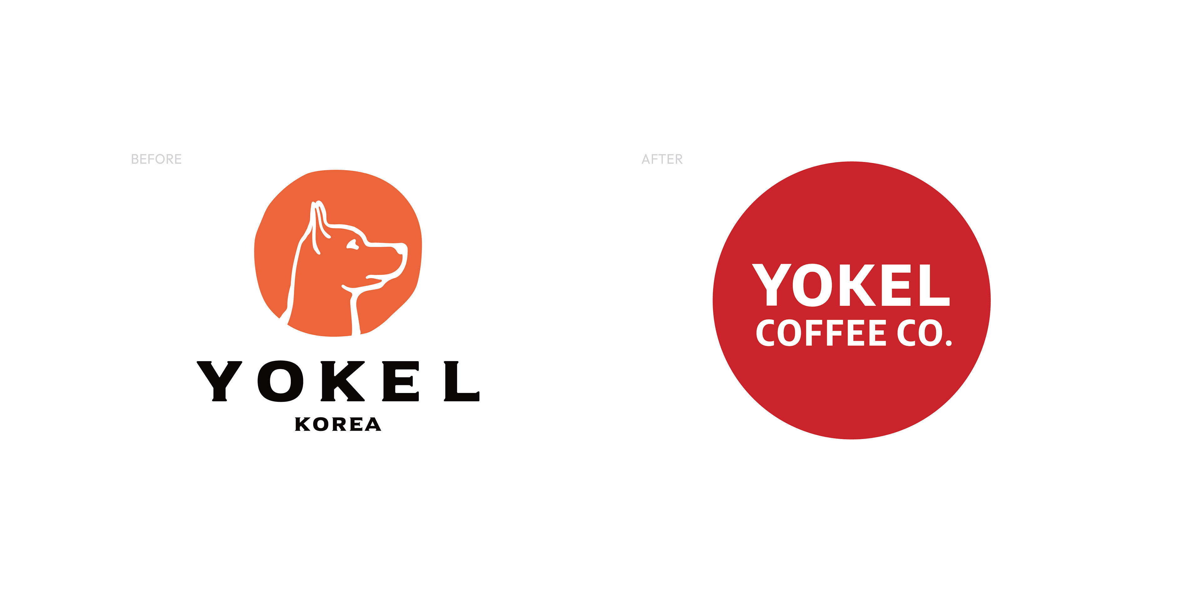
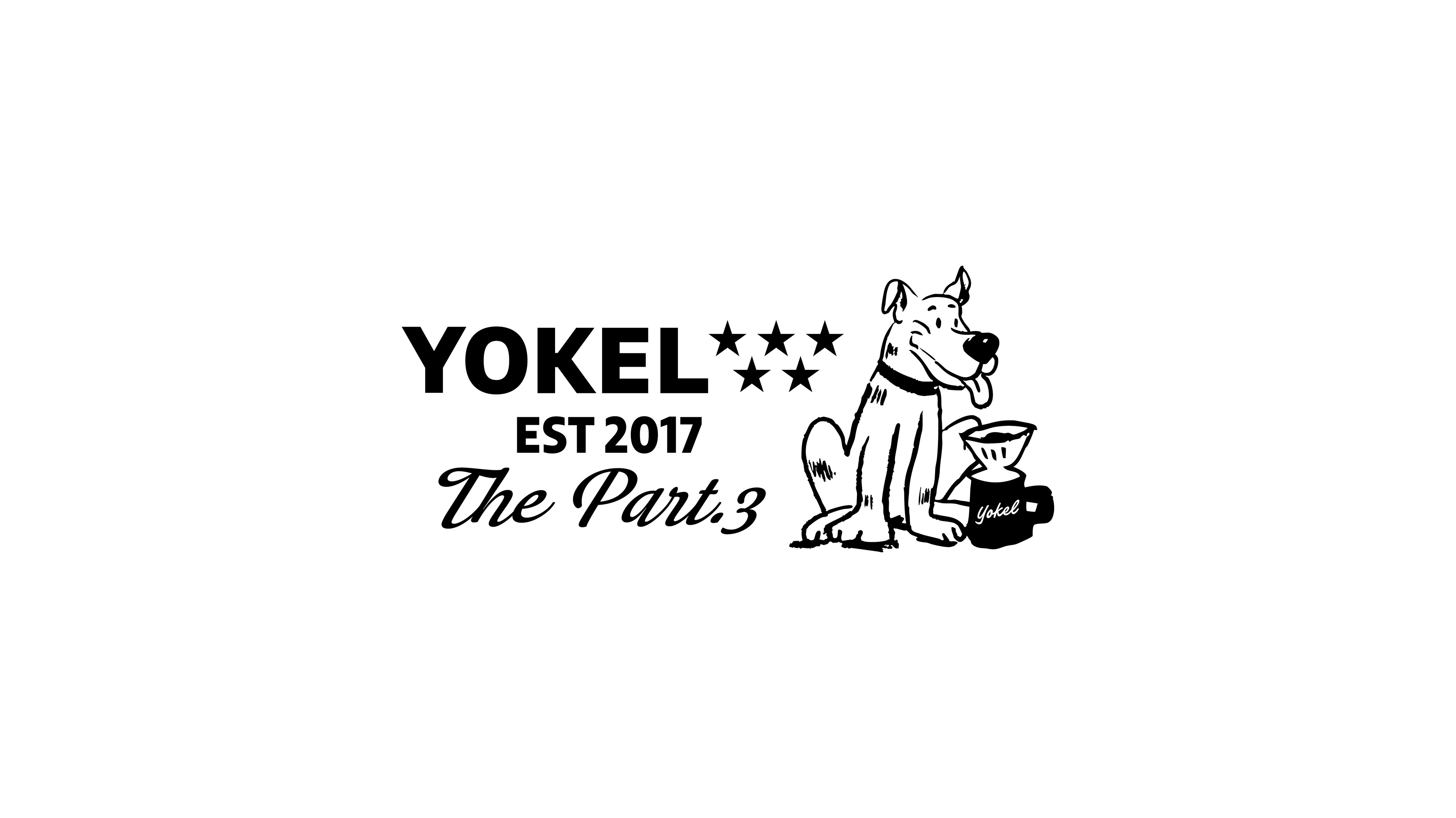
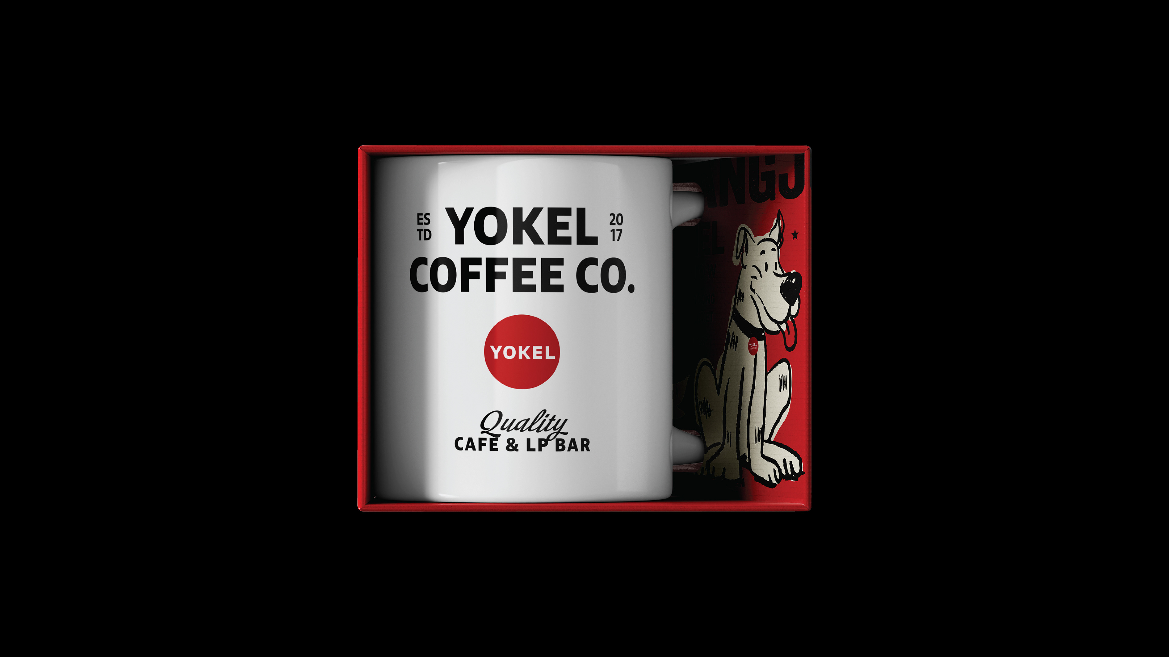
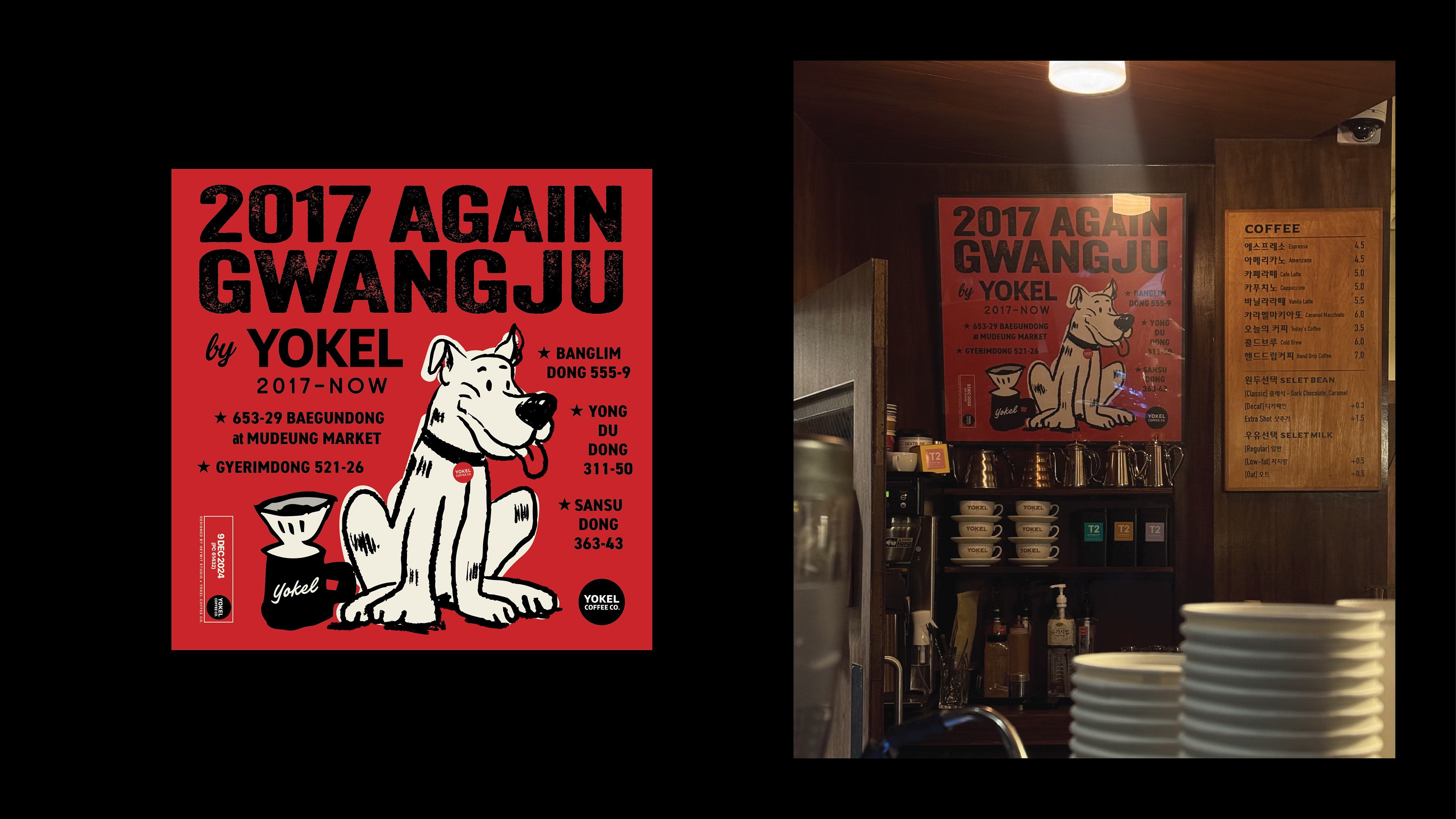
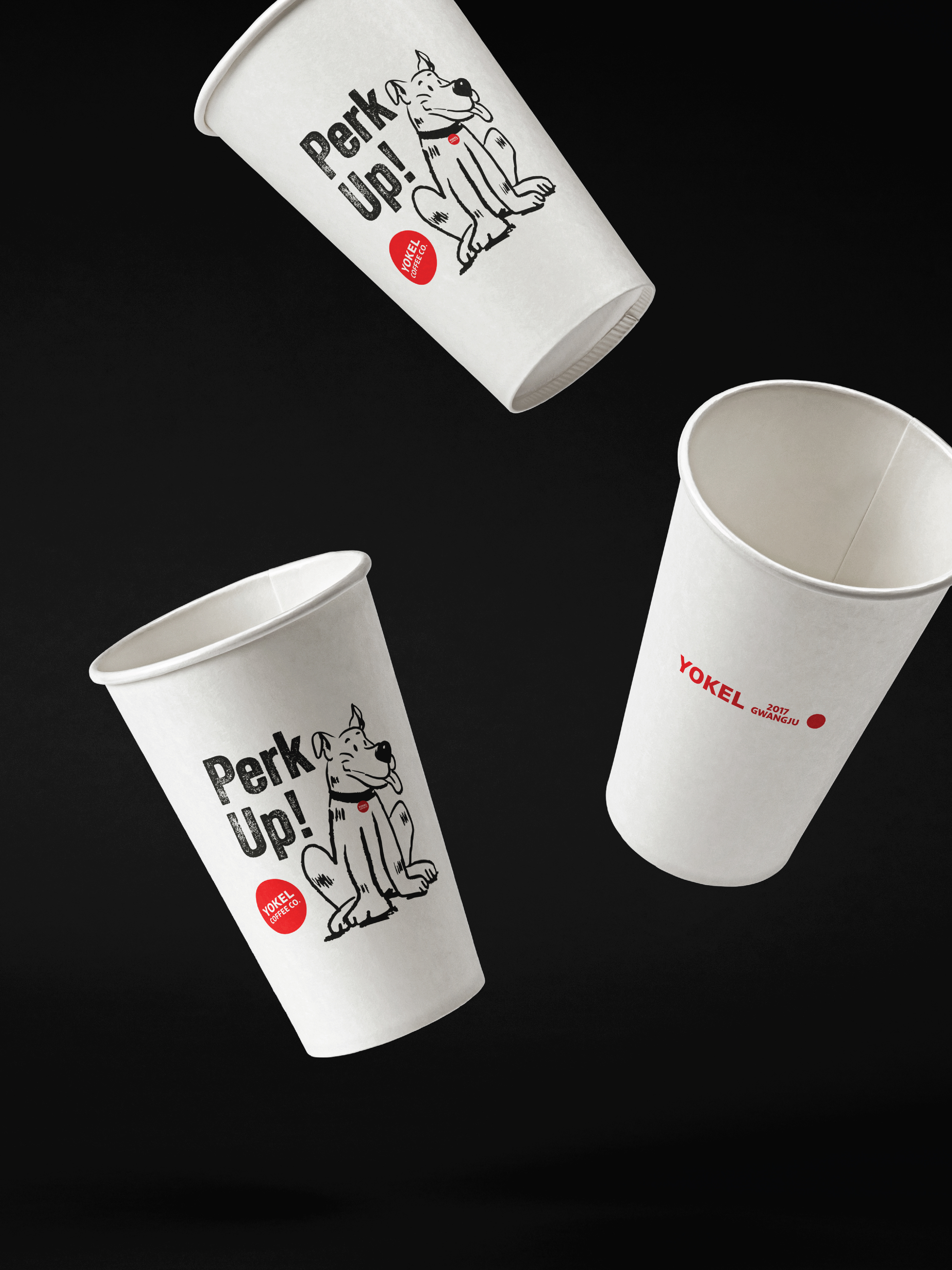
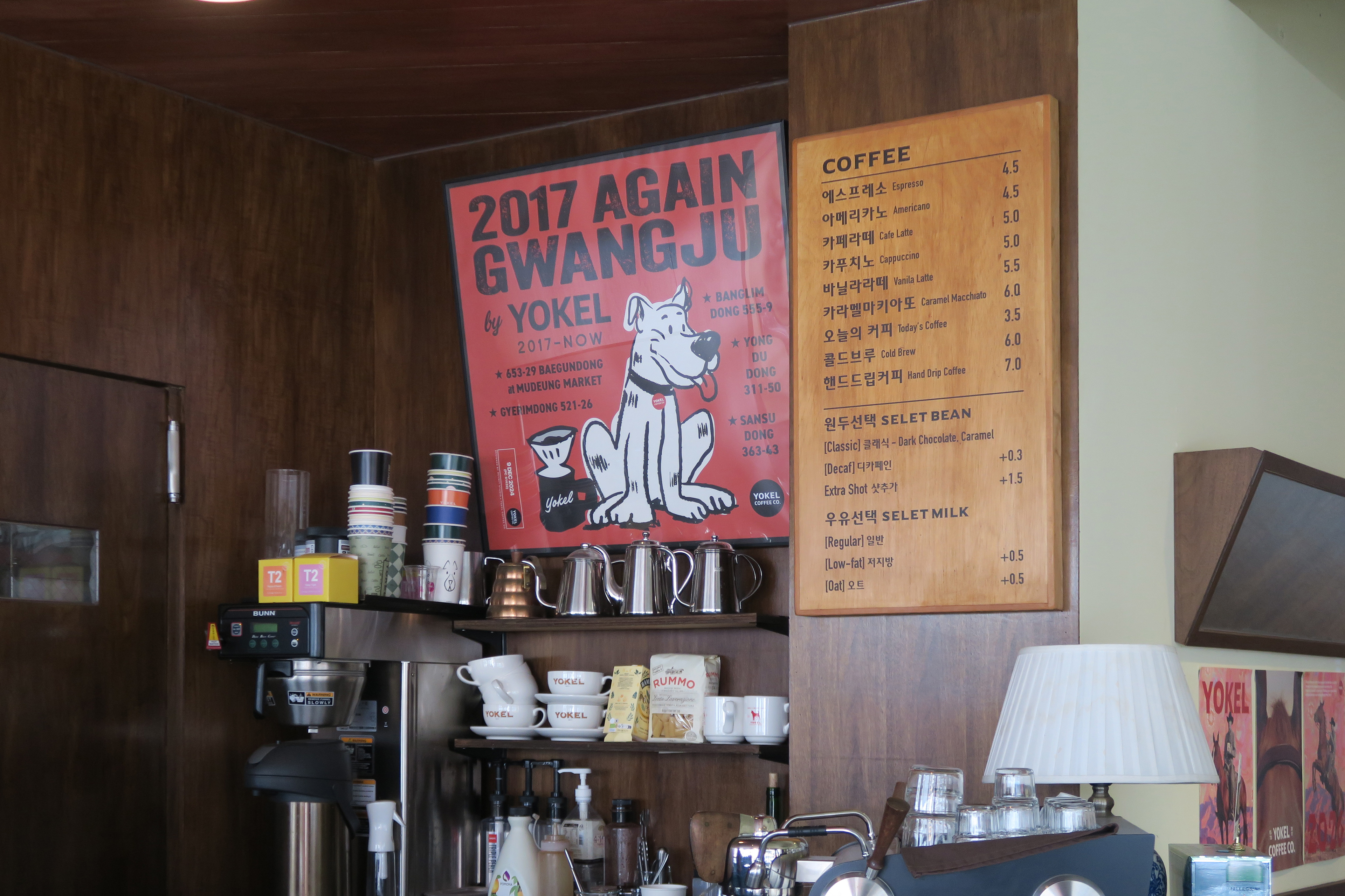
기존 심벌로 사용되었던 강아지 ‘오디’는
애견카페로 인식되는 점을 고려해 메인 로고에서 분리하고
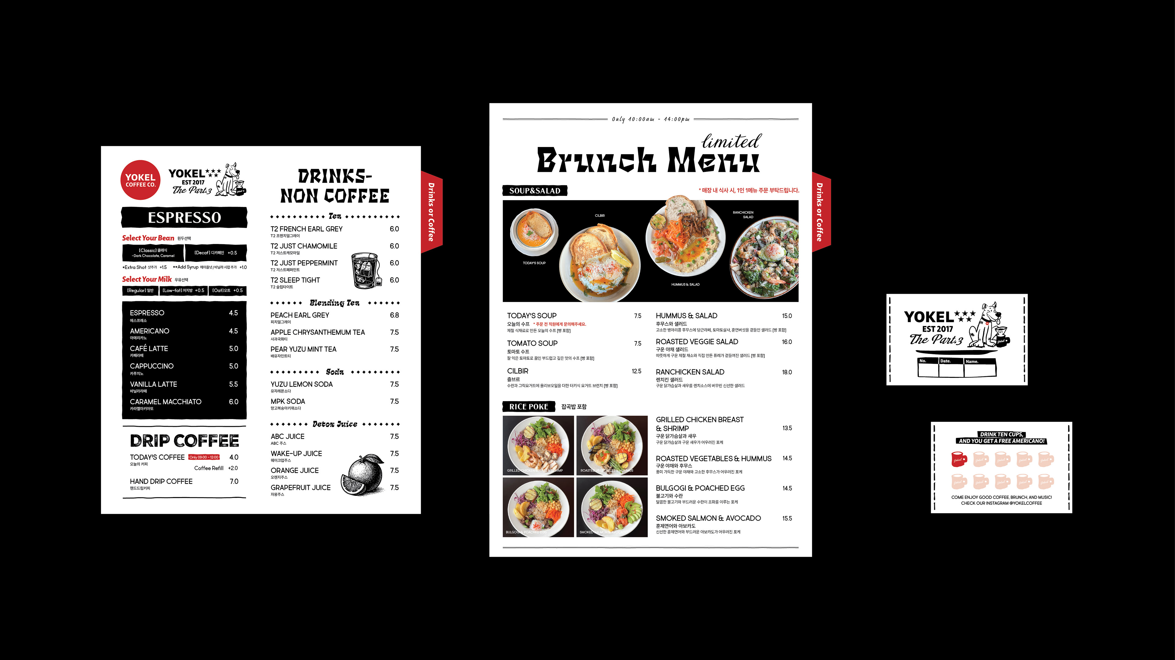
서부 빈티지 무드를 담은 일러스트로 재해석하여
메뉴판, 패키지, 쿠폰 등 다양한 브랜드 접점에 활용했습니다.
애견카페로 인식되는 점을 고려해 메인 로고에서 분리하고
서부 빈티지 무드를 담은 일러스트로 재해석하여
메뉴판, 패키지, 쿠폰 등 다양한 브랜드 접점에 활용했습니다.
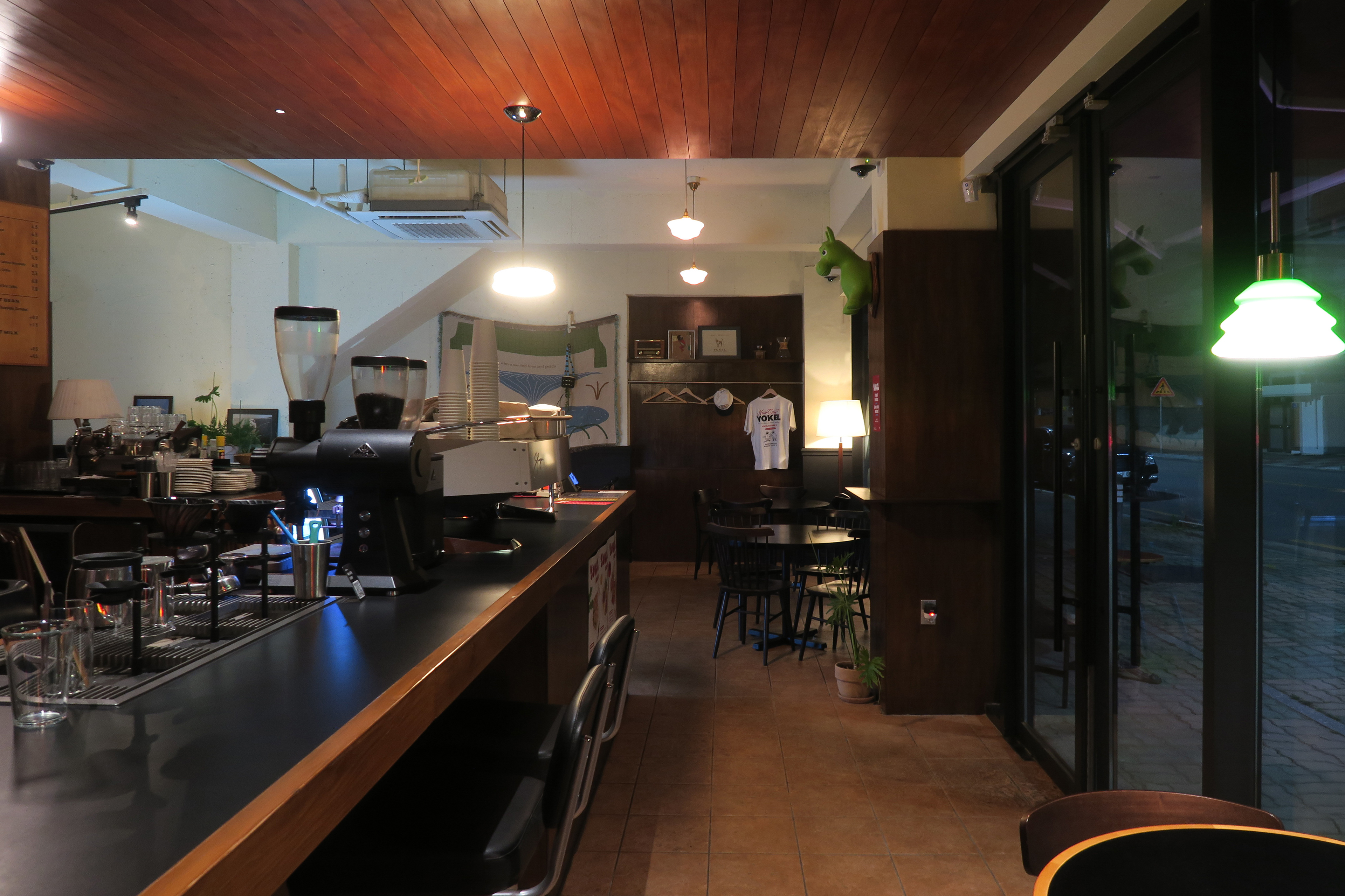
심플하고 직관적인 로고타입과
러프한 빈티지 일러스트, 그리고 강렬한 레드 심벌의 조합은
요켈만의 LP바 감성과 브런치 카페 무드를 동시에 표현하며
‘Part.3’ 브랜드 아이덴티티를 완성합니다.
러프한 빈티지 일러스트, 그리고 강렬한 레드 심벌의 조합은
요켈만의 LP바 감성과 브런치 카페 무드를 동시에 표현하며
‘Part.3’ 브랜드 아이덴티티를 완성합니다.
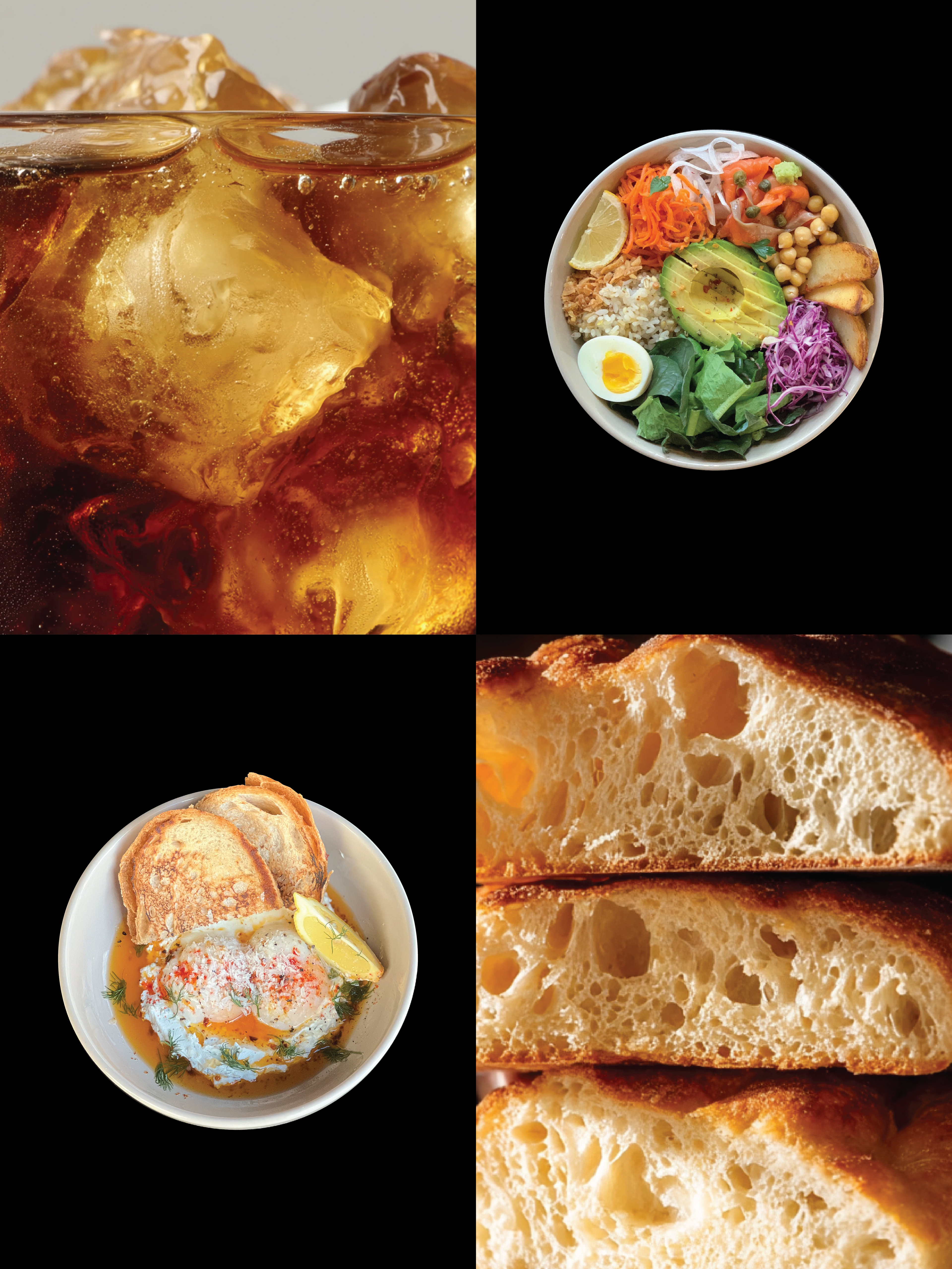
커피를 중심으로 베이커리, 샐러드, 포케 등으로 확장해온 요켈은
산수동에서의 새로운 챕터를 통해
브랜드가 쌓아온 무드와 방향성을 더욱 선명하게 보여주며
일상 속 가장 따뜻한 F&B 브랜드로 자리하고자 합니다.
산수동에서의 새로운 챕터를 통해
브랜드가 쌓아온 무드와 방향성을 더욱 선명하게 보여주며
일상 속 가장 따뜻한 F&B 브랜드로 자리하고자 합니다.
Yokel Coffee is a brand renewal project
developed following its relocation
from Gyerim-dong to Sansu-dong.
developed following its relocation
from Gyerim-dong to Sansu-dong.
Inspired by urban bus stop buttons,
the circular symbol was designed to create a strong
visual presence that remains recognizable from a distance
while evoking the warm afterglow of bokeh lights.
The symbol reflects Yokel's philosophy
of staying close to everyday life.
the circular symbol was designed to create a strong
visual presence that remains recognizable from a distance
while evoking the warm afterglow of bokeh lights.
The symbol reflects Yokel's philosophy
of staying close to everyday life.
The original mascot, Odi the dog, was removed
from the primary logo system to avoid associations
with a pet café and reinterpreted
as a Western vintage-inspired illustration.
The character is now applied across menus, packaging,
coupons, and various brand touchpoints.
from the primary logo system to avoid associations
with a pet café and reinterpreted
as a Western vintage-inspired illustration.
The character is now applied across menus, packaging,
coupons, and various brand touchpoints.
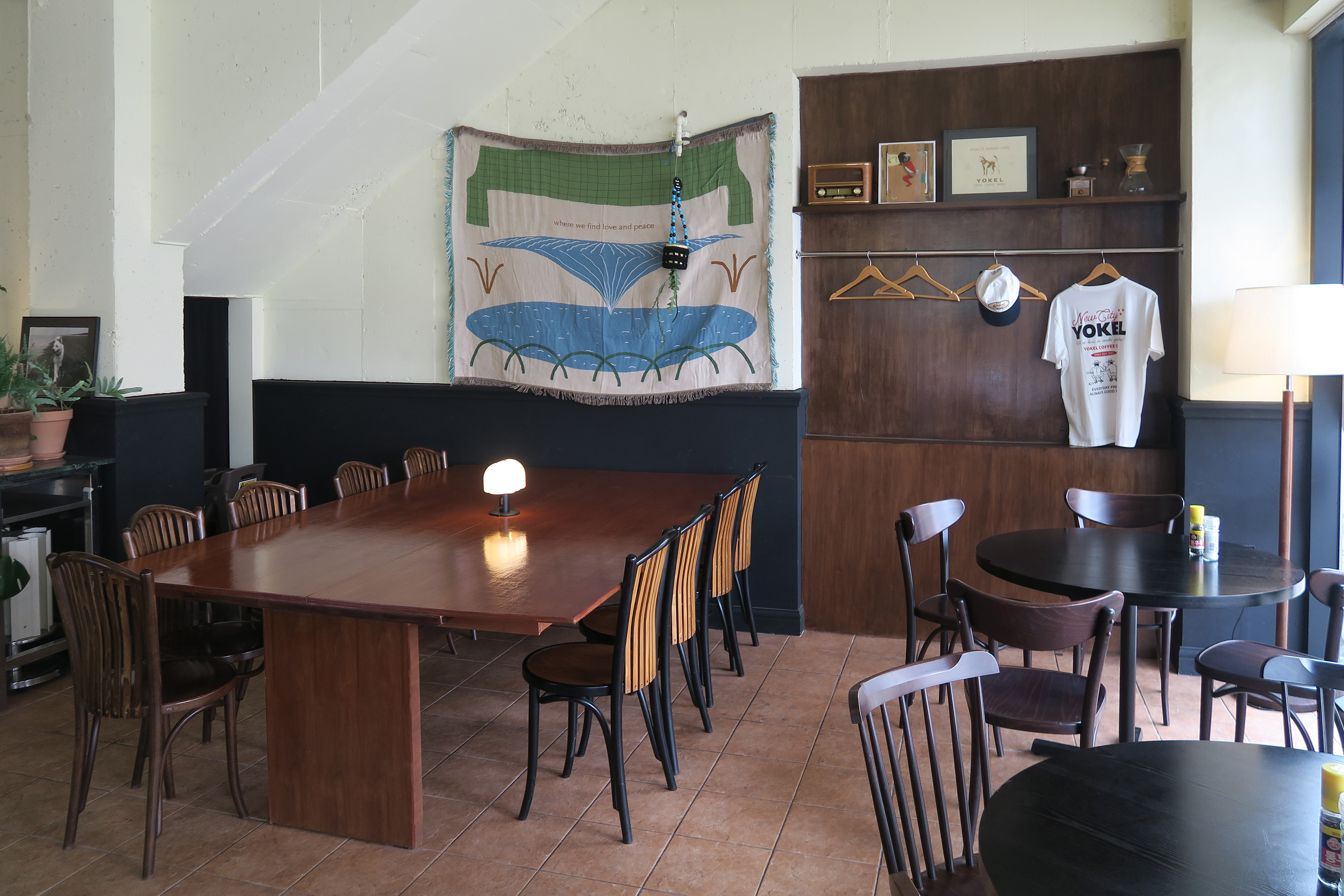
Built around a simple logotype,
vintage-inspired graphics, and a bold red symbol,
the identity system captures both the atmosphere of
an LP bar and the warmth of a neighborhood brunch café,
forming Yokel's distinctive "Part.3" brand identity.
vintage-inspired graphics, and a bold red symbol,
the identity system captures both the atmosphere of
an LP bar and the warmth of a neighborhood brunch café,
forming Yokel's distinctive "Part.3" brand identity.
Having expanded beyond coffee into bakery, salads,
and poke, Yokel begins a new chapter in Sansu-dong
with a clearer expression of its established mood and direction.
and poke, Yokel begins a new chapter in Sansu-dong
with a clearer expression of its established mood and direction.
A warm and familiar brand
designed to stay close to everyday life.
designed to stay close to everyday life.
@l2nworks